


Historical Family Home
Walking over the threshold of this Grade II* London townhouse for the first time in 2021 was quite exciting. Built in the 1880s, in the heyday of Arts & Crafts, this building is a child of its time with a generous amount of decorative eclecticism sprinkled on top. It is obvious its architect revered the past but mod-cons were at the same time wholeheartedly embraced. It seems that anything that was deemed good could be used, regardless of where or when it came from. This suited us down to a T.

See More
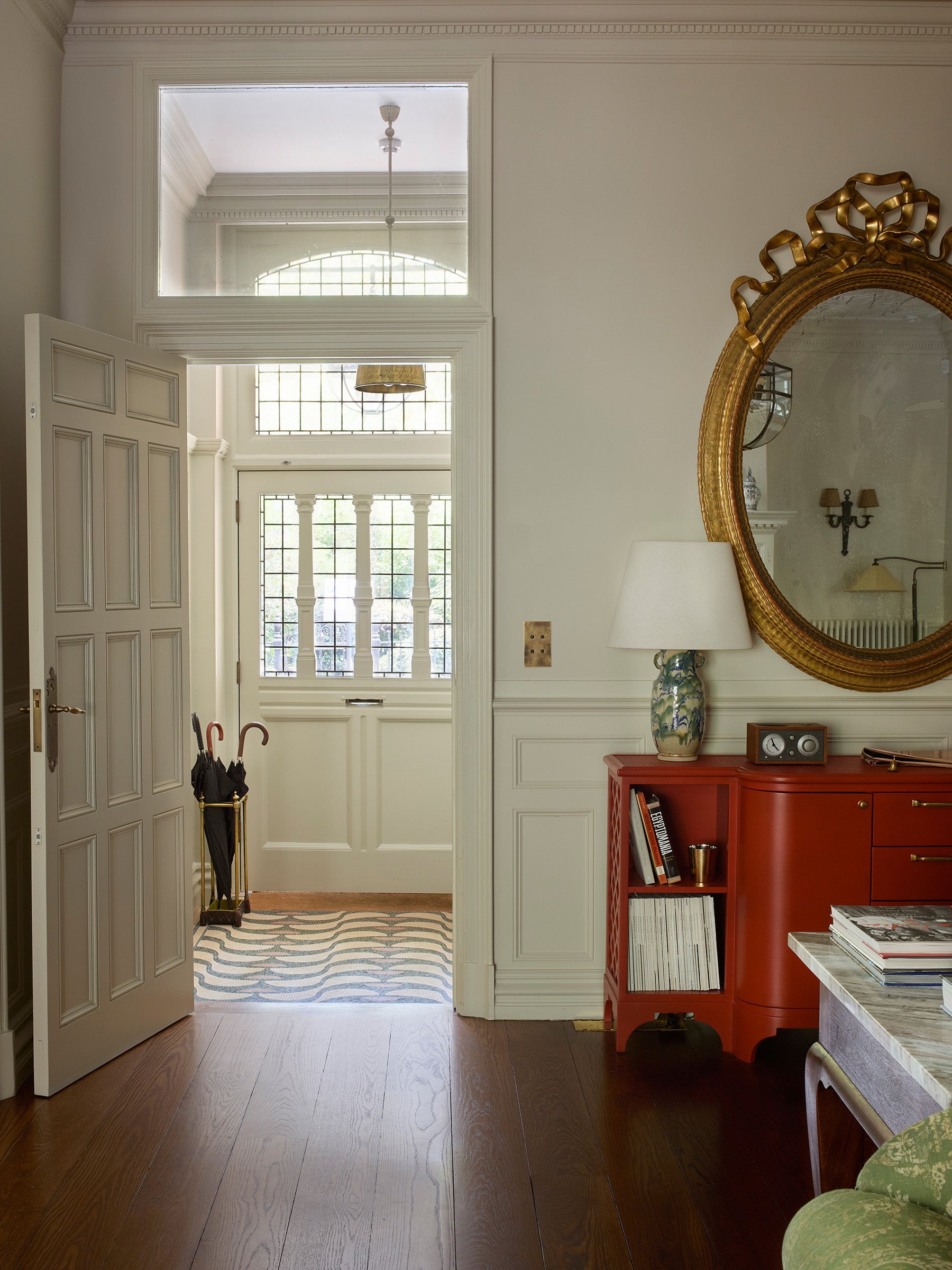
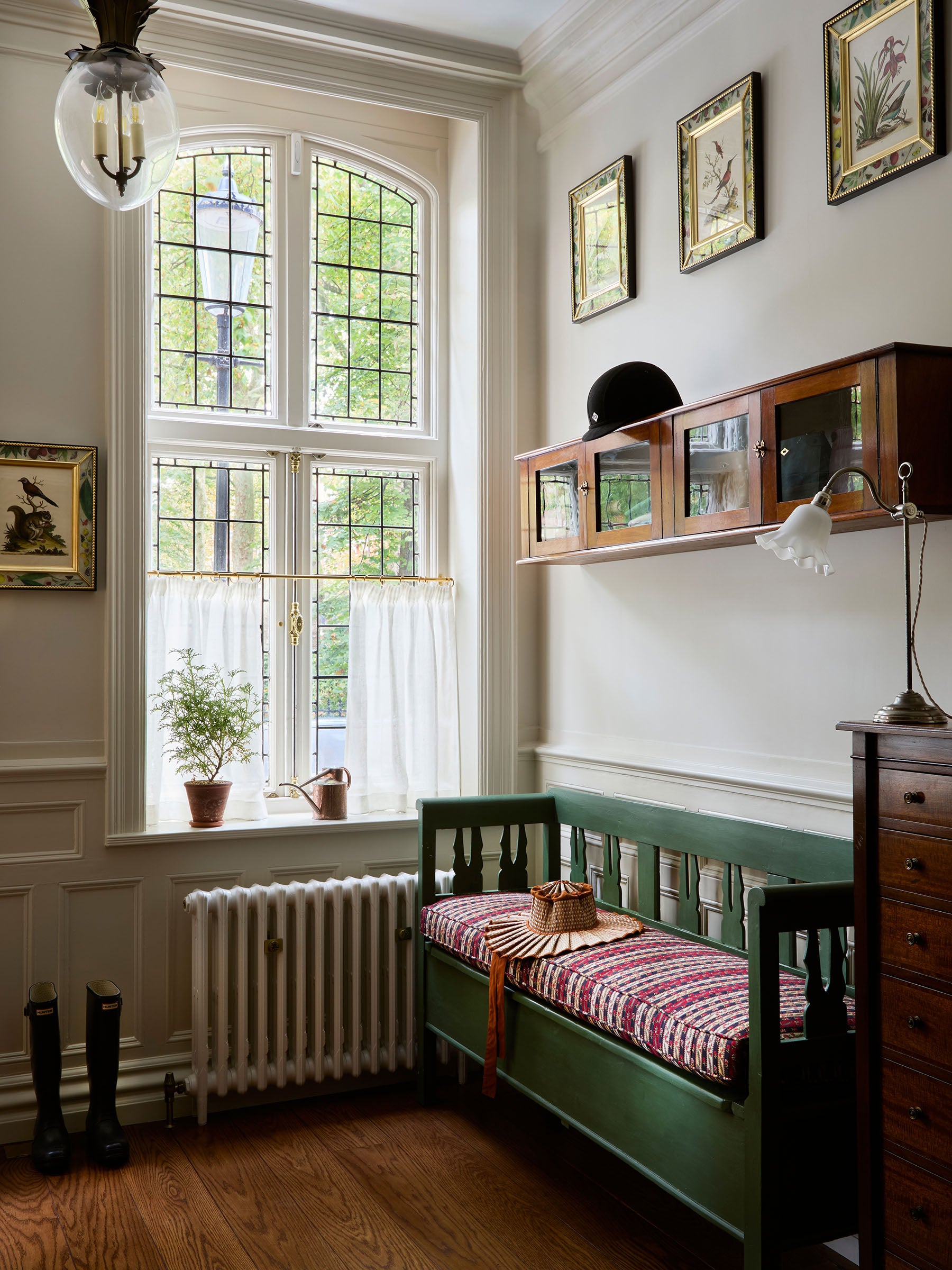
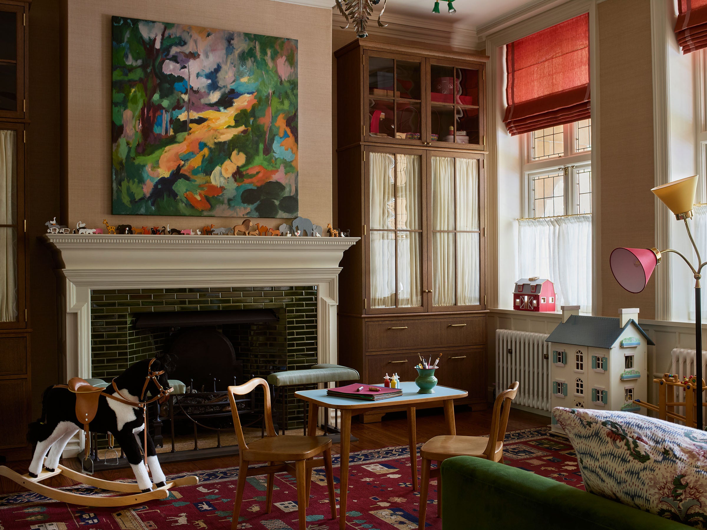
It was clear from the the start that the rooms could speak for themselves. There was no need to shout to make them a thing. Our task was to gently add spirit and ensure it worked beautifully for our clients and their three young children. We created a boot room next to the main entry (right above) and the former formal dining room was turned into a playroom (below).
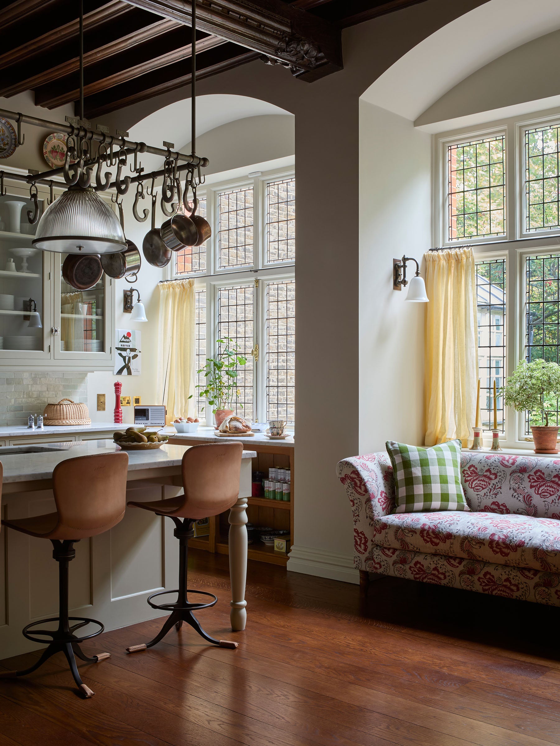
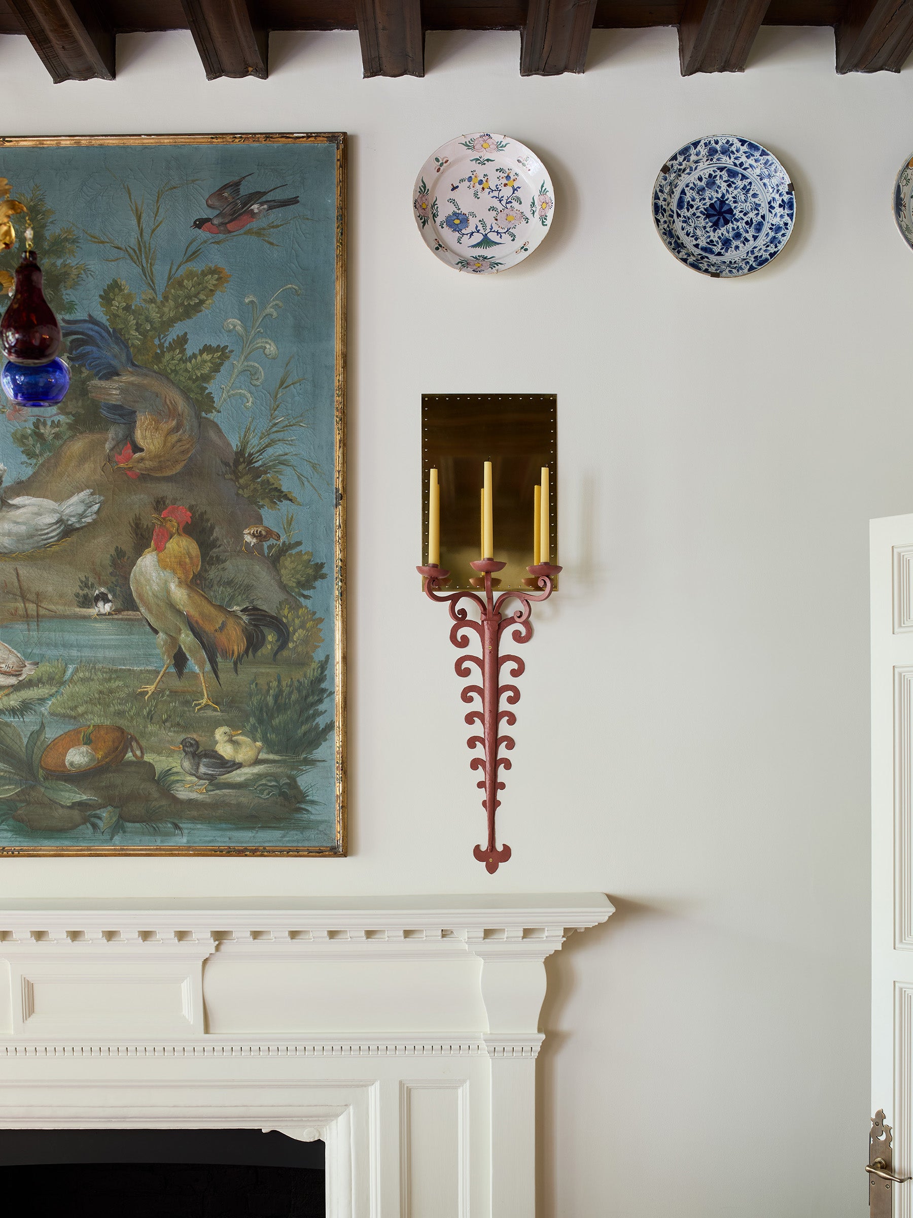
The kitchen (right and below) with its carved ceiling, complete with gargoyles at the base of each cross beam, and leaded arched windows looking over the communal gardens. Lovely Mog settled in quickly and now roams the gardens with a worldly air. The plates along the perimeter of the room were collected one by one for the duration of the project. The 18th century painting over the fireplace was the very first thing we bought for the house!
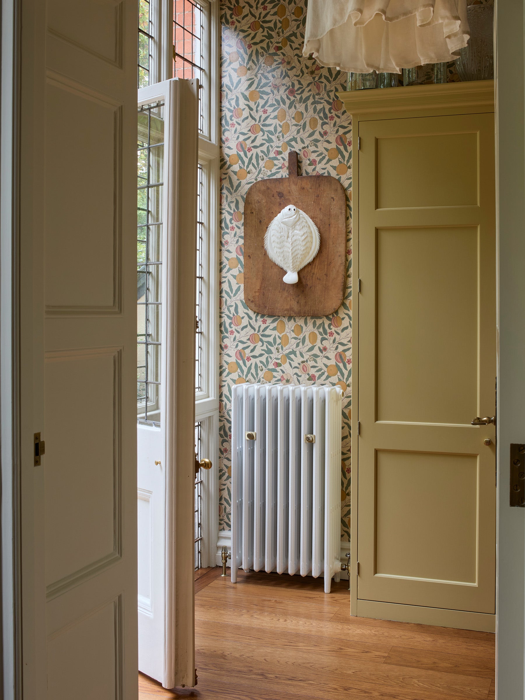
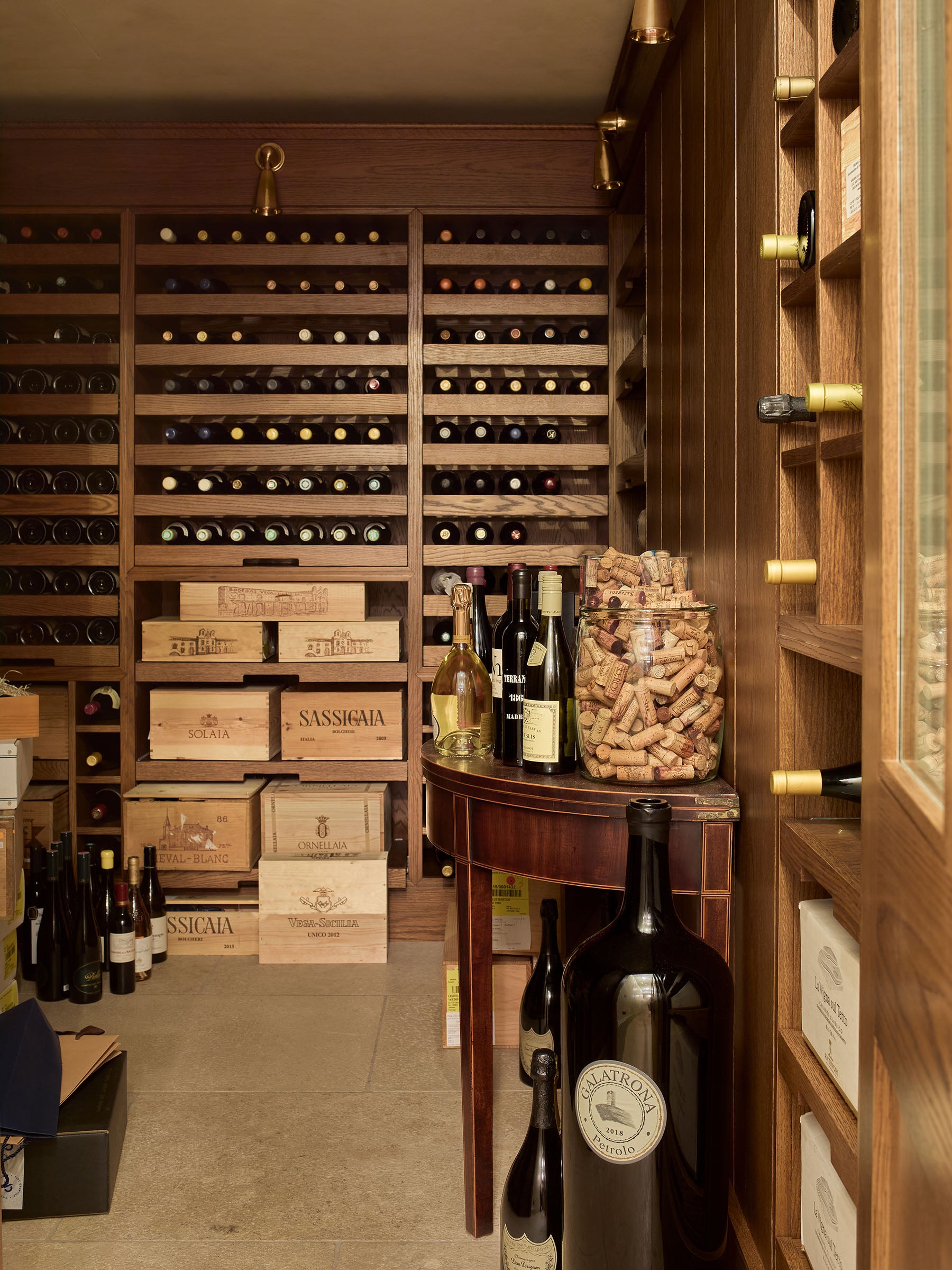
We covered the larder off the kitchen (left) with a William Morris paper which he designed around the time the house was built. We decided to varnish it to give it the appearance of a wax cloth. The wine cellar on the lower ground floor (below) was a new addition and our ambition was for it to feel like a natural extension of the existing house.
We covered the larder off the kitchen (left) with a William Morris paper which he designed around the time the house was built. We decided to varnish it to give it the appearance of a wax cloth. The wine cellar on the lower ground floor (below) was a new addition and our ambition was for it to feel like a natural extension of the existing house.
We covered the larder off the kitchen (left) with a William Morris paper which he designed around the time the house was built. We decided to varnish it to give it the appearance of a wax cloth. The wine cellar on the lower ground floor (below) was a new addition and our ambition was for it to feel like a natural extension of the existing house.
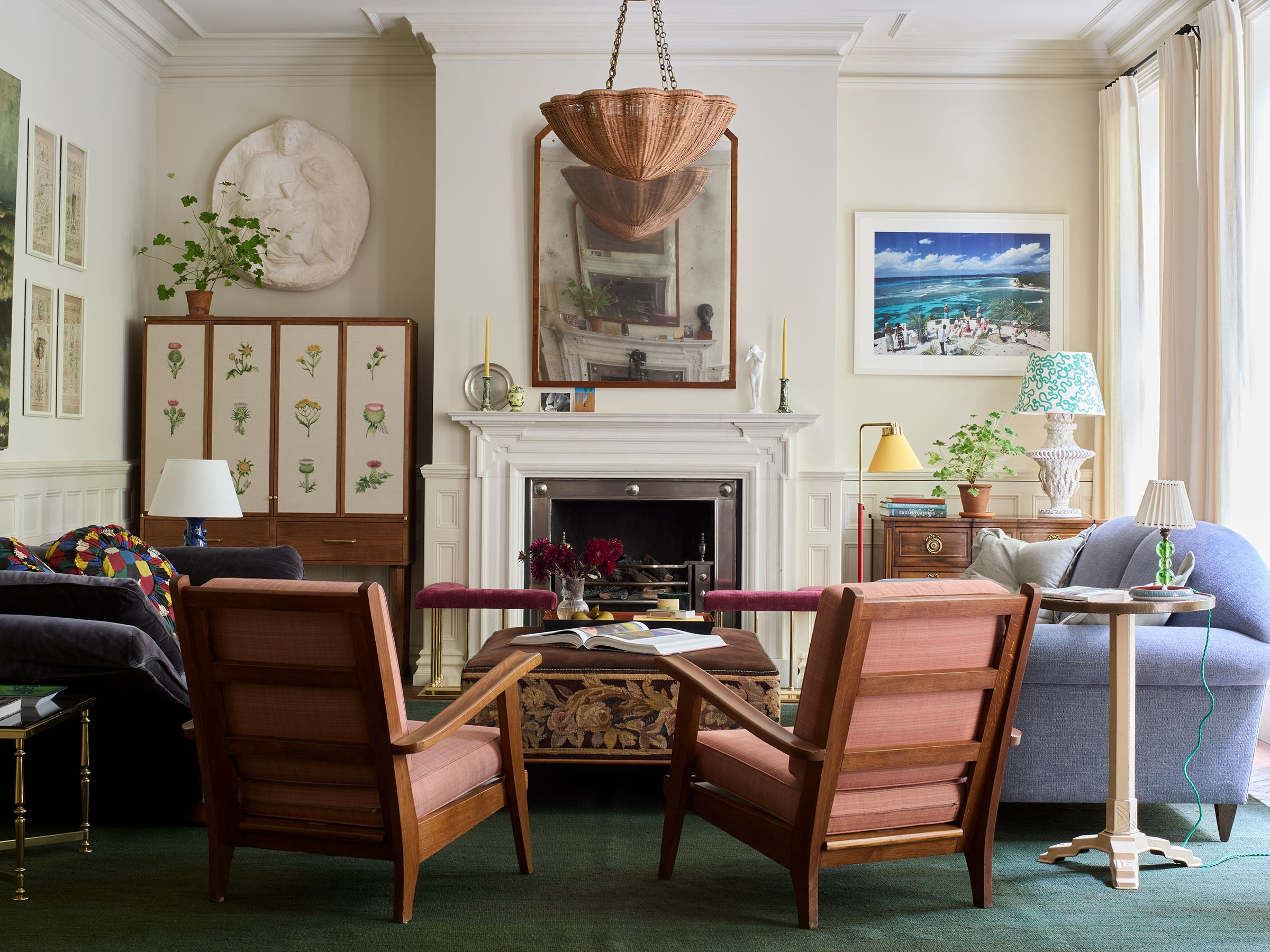
The drawing room is bookended by two fireplaces (not original but we decided to keep them to avoid waste). We created a generous seating area with a huge 140cm deep sofa on one side. We put a library corner by the other fireplace with a love seat that overlooks the grand piano. A delightful spot to play!
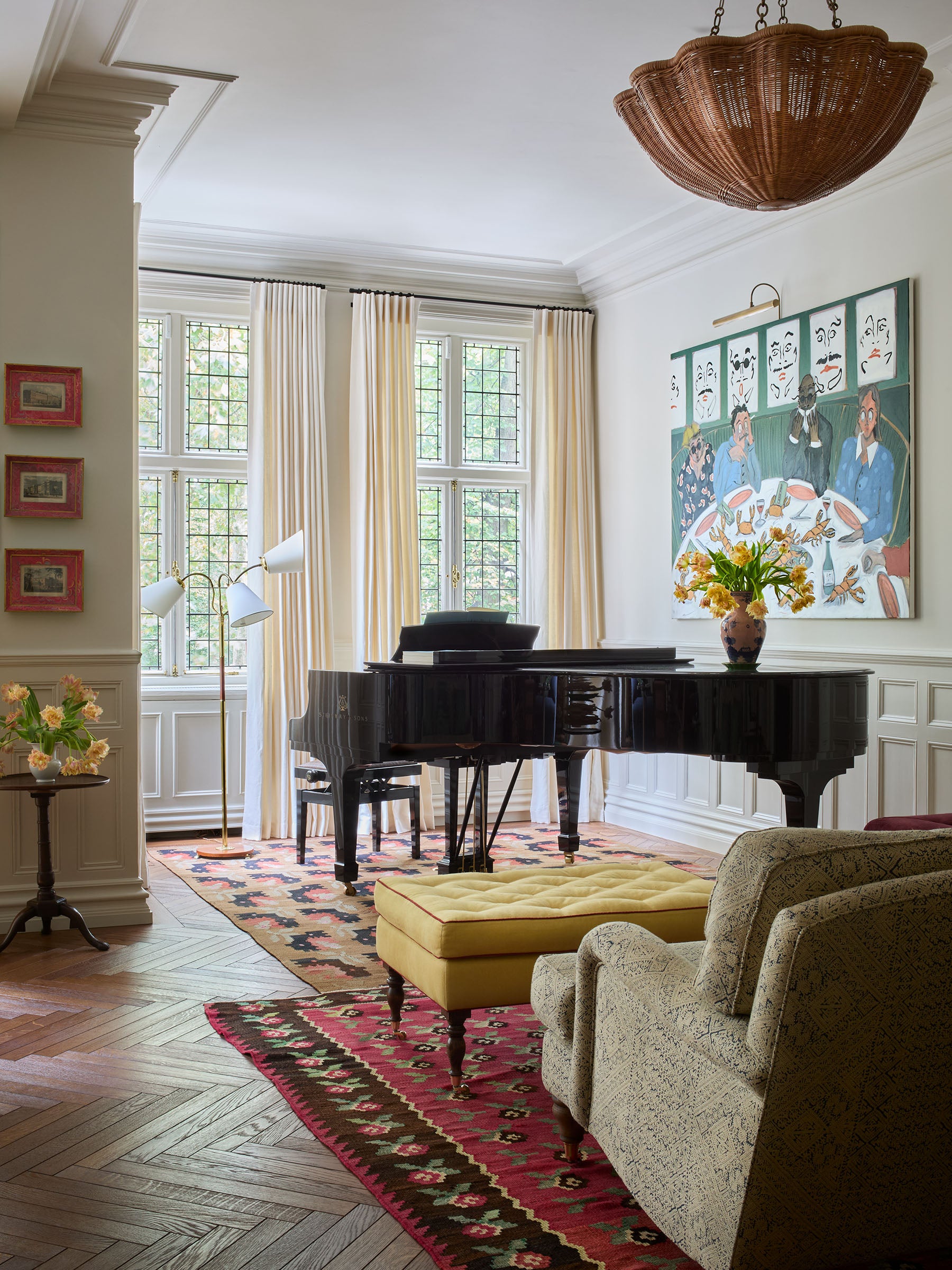
The drawing room is bookended by two fireplaces (not original but we decided to keep them to avoid waste). We created a generous seating area with a huge 140cm deep sofa on one side. We put a library corner by the other fireplace with a love seat that overlooks the grand piano. A delightful spot to play!
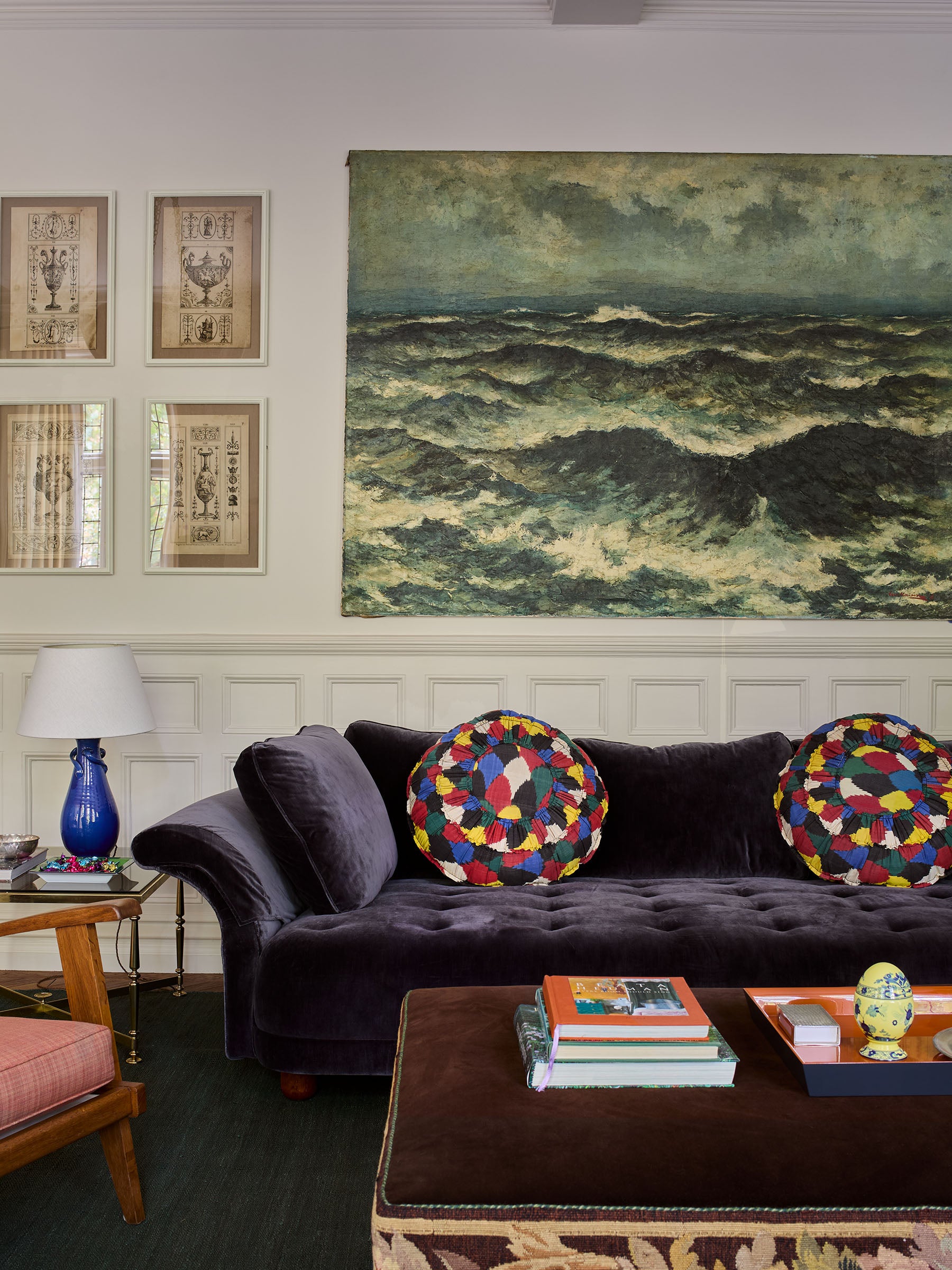
The drawing room is bookended by two fireplaces (not original but we decided to keep them to avoid waste). We created a generous seating area with a huge 140cm deep sofa on one side. We put a library corner by the other fireplace with a love seat that overlooks the grand piano. A delightful spot to play!
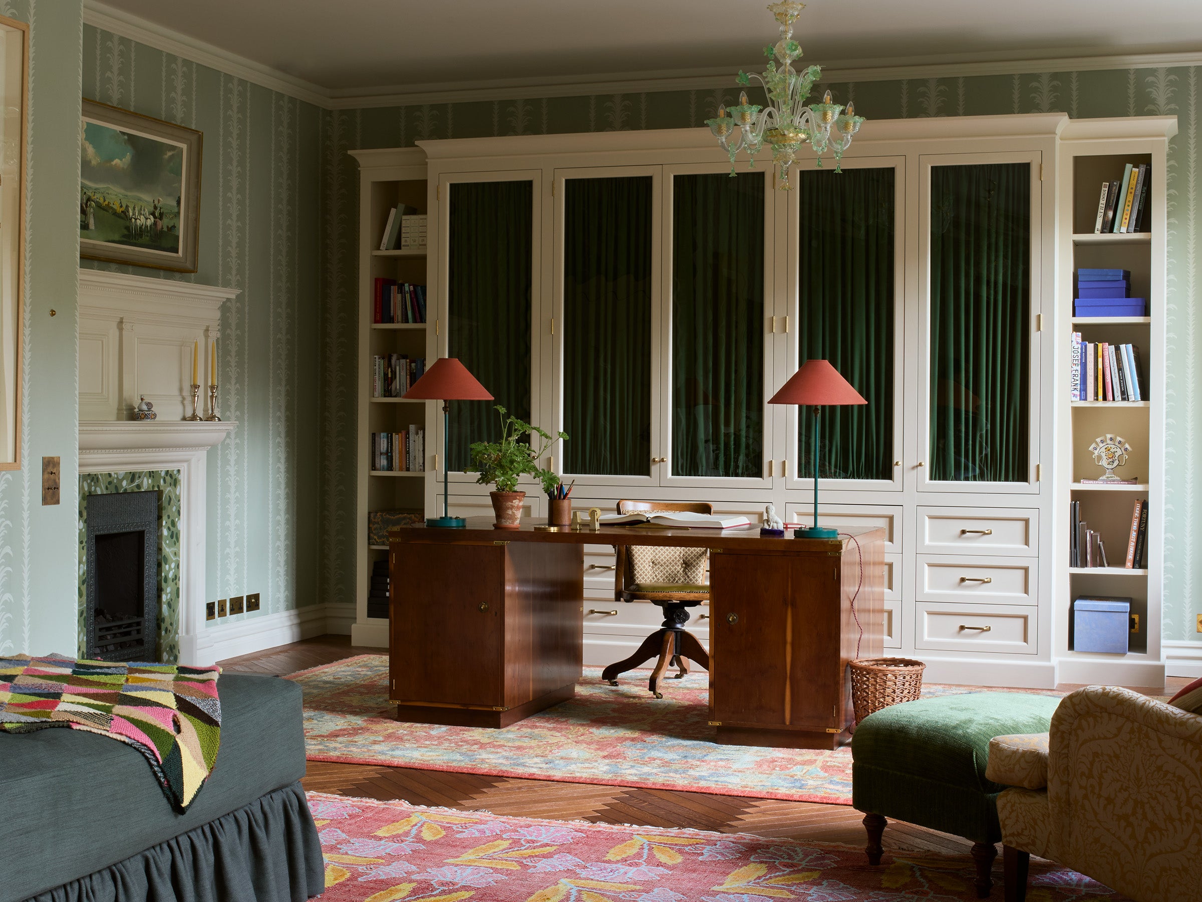
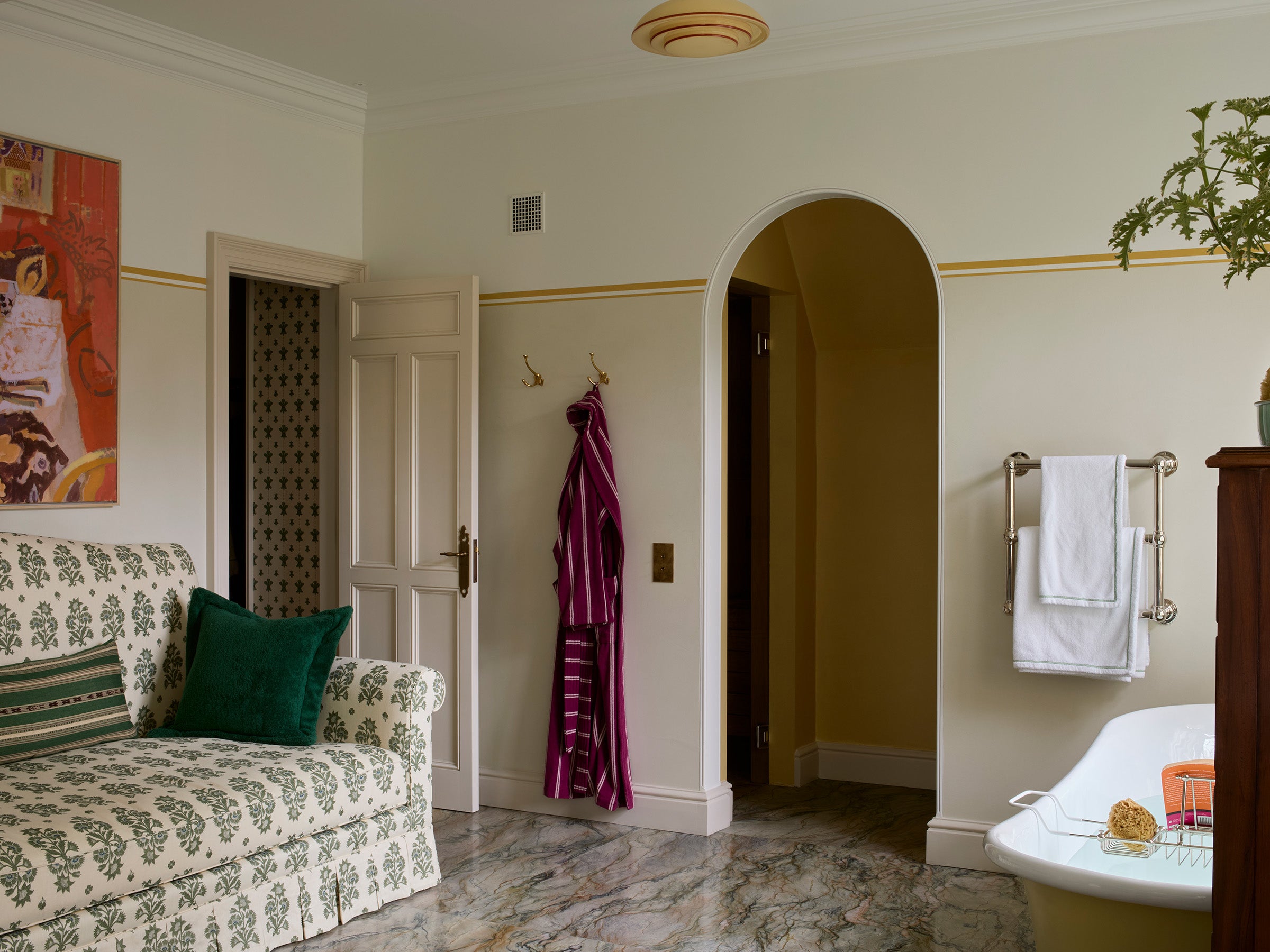
This room, now the study, was a mega home cinema when we found it: dark, sound proofed and arranged over a tiered floor. It seemed a waste with its glorious east facing views over the gardens. We unearthed all sort of goodies as we began stripping out. The fireplace became a feature and the door into the powder room (below) was re-instated having been blocked up to give way to the machinery needed for the projector and turned into a delightful bathroom. We also found some original, tall and skinny oak parquet flooring that sadly couldn’t be saved so we had it faithfully reproduced.
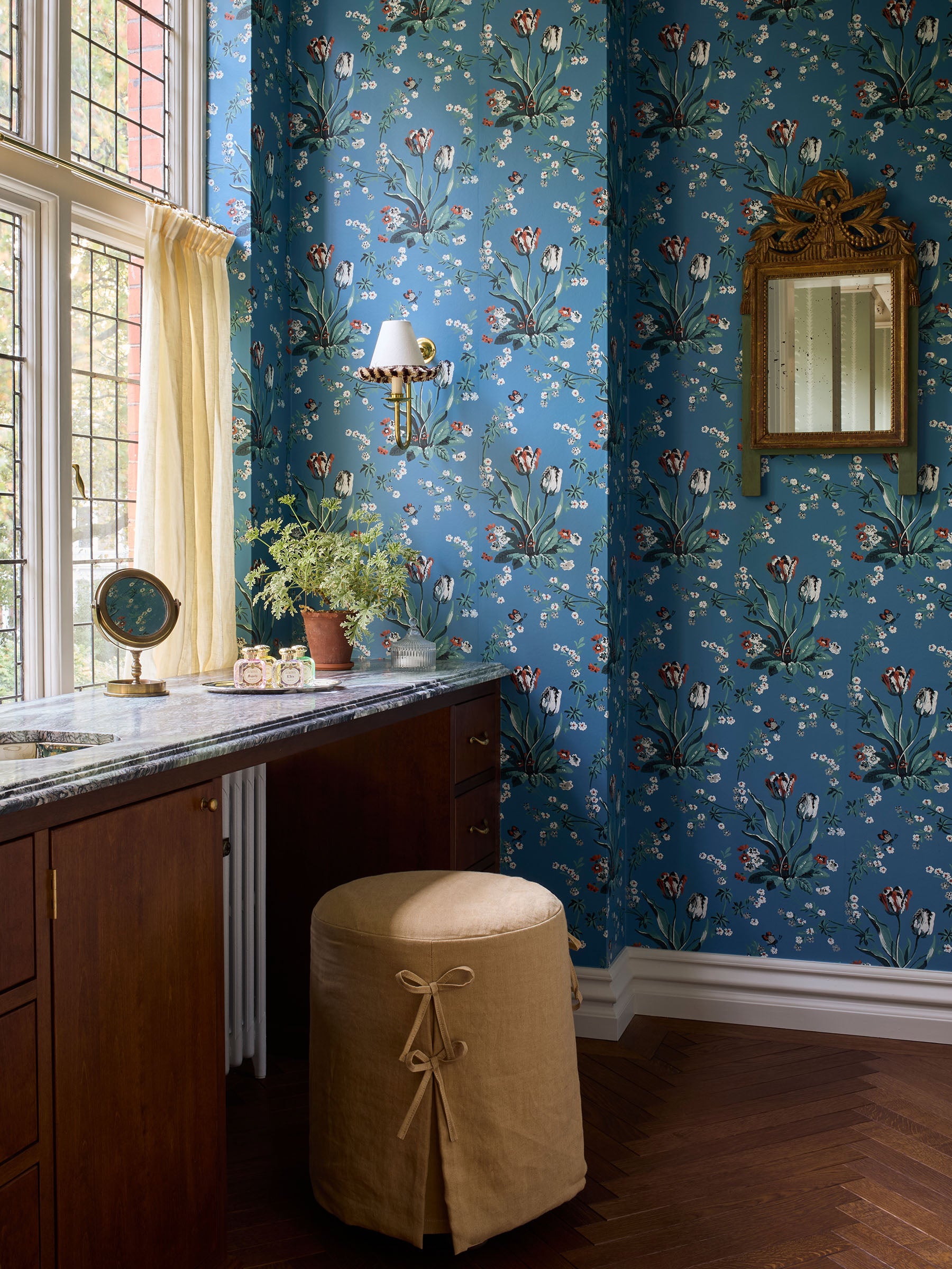

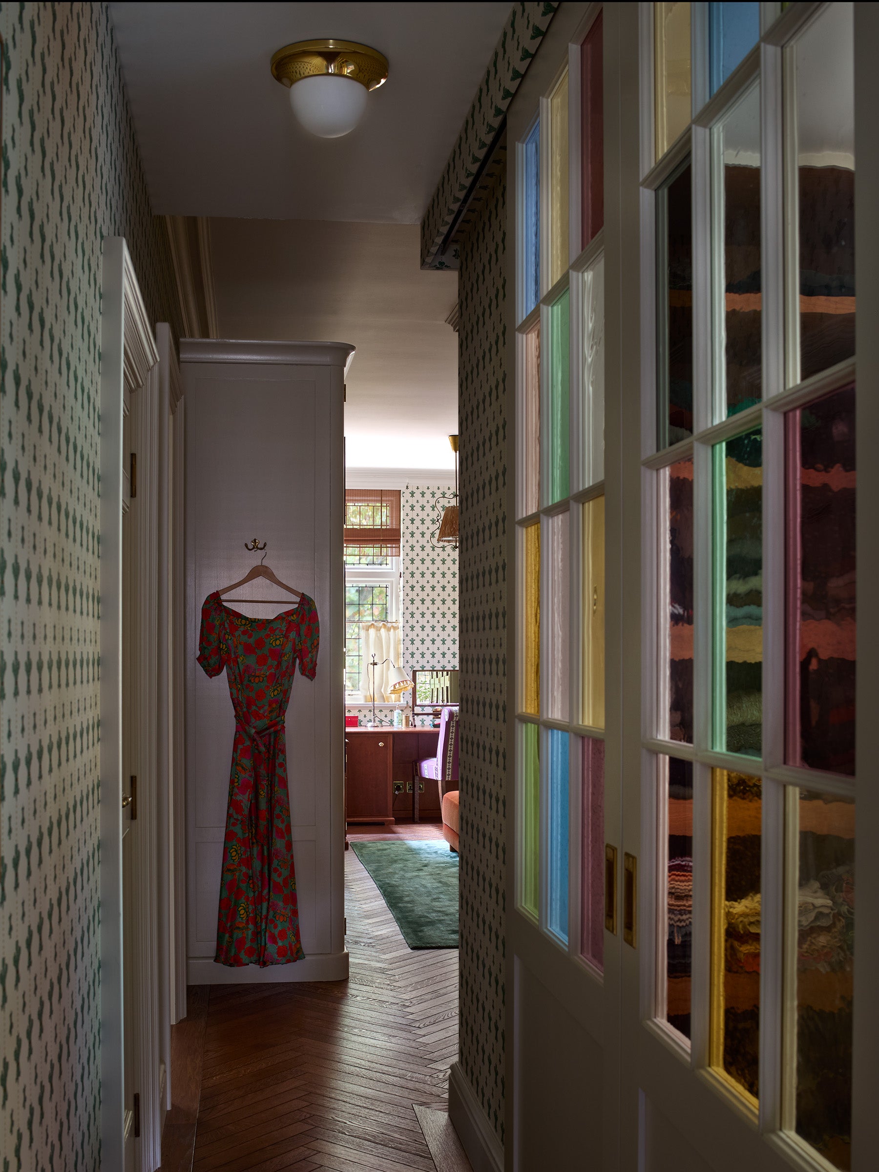
The sloping wall in the main bedroom (above) was a bit of a challenge. Up against it was the most harmonious position for the bed but the wall itself felt encroaching. We designed a canopy that followed this line and it solved the problem! It feels both comforting and uplifting. The dressing room comes off the bedroom. The wardrobe doors are covered in 19th century fashion prints.
The sloping wall in the main bedroom (above) was a bit of a challenge. Up against it was the most harmonious position for the bed but the wall itself felt encroaching. We designed a canopy that followed this line and it solved the problem! It feels both comforting and uplifting. The dressing room comes off the bedroom. The wardrobe doors are covered in 19th century fashion prints.
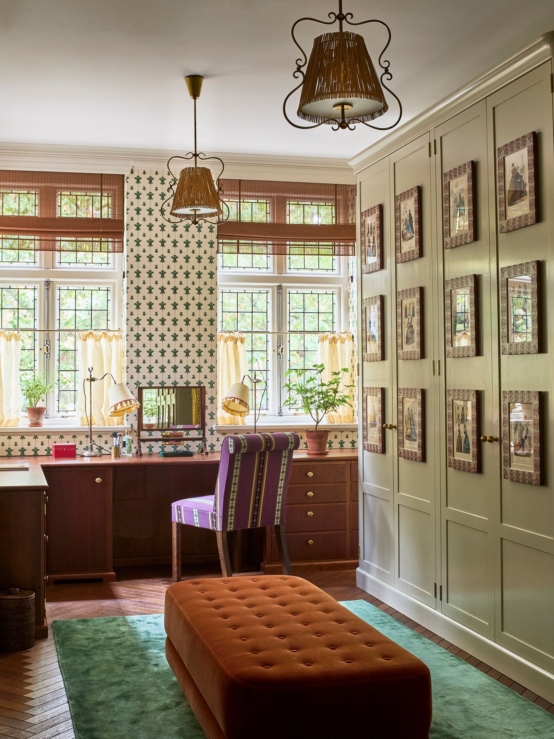
The sloping wall in the main bedroom (above) was a bit of a challenge. Up against it was the most harmonious position for the bed but the wall itself felt encroaching. We designed a canopy that followed this line and it solved the problem! It feels both comforting and uplifting. The dressing room comes off the bedroom. The wardrobe doors are covered in 19th century fashion prints.
"Indeed, a conscious choice was made to let the property's architecture be the star of the show, with the interiors playing a supporting, albeit crucial, role. Nothing is too new or jarring, creating a look that appears to have evolved over time."Busola Evans, Architectural Digest, (December 2024).
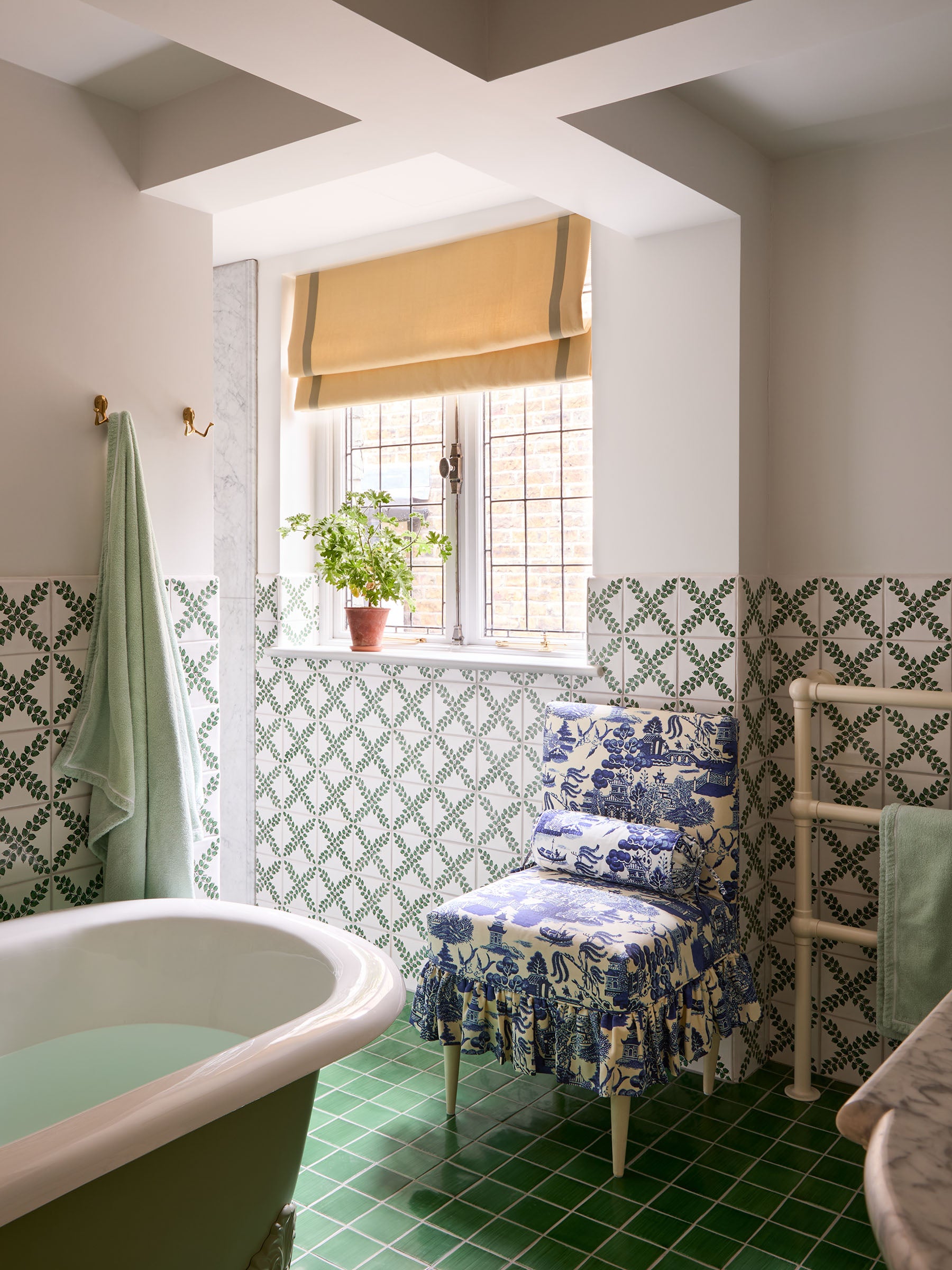
If you walk along the corridor past the dressing room it will take you to the main bathroom. We wanted it to be calm and comfortable. The floor is a rather spectacular marble but because of the greens and ochre tones it still feels grounded and earthy. The walls are covered in micro concrete which is water proof and handles like plaster, allowing us to have a smooth finish without any grout lines or seams. The contrast band three quarters up is specialist painted.
If you walk along the corridor past the dressing room it will take you to the main bathroom. We wanted it to be calm and comfortable. The floor is a rather spectacular marble but because of the greens and ochre tones it still feels grounded and earthy. The walls are covered in micro concrete which is water proof and handles like plaster, allowing us to have a smooth finish without any grout lines or seams. The contrast band three quarters up is specialist painted.
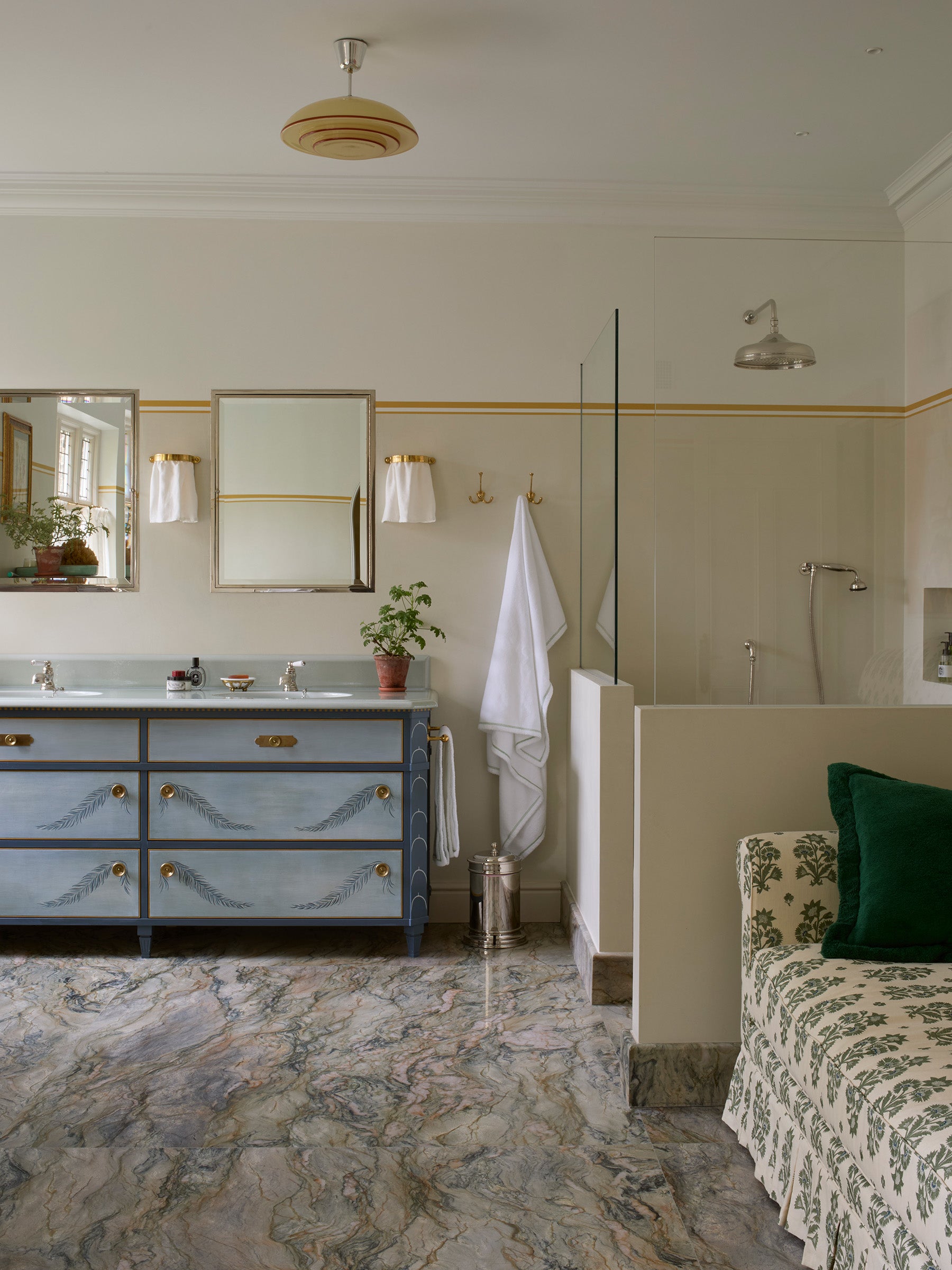
If you walk along the corridor past the dressing room it will take you to the main bathroom. We wanted it to be calm and comfortable. The floor is a rather spectacular marble but because of the greens and ochre tones it still feels grounded and earthy. The walls are covered in micro concrete which is water proof and handles like plaster, allowing us to have a smooth finish without any grout lines or seams. The contrast band three quarters up is specialist painted.
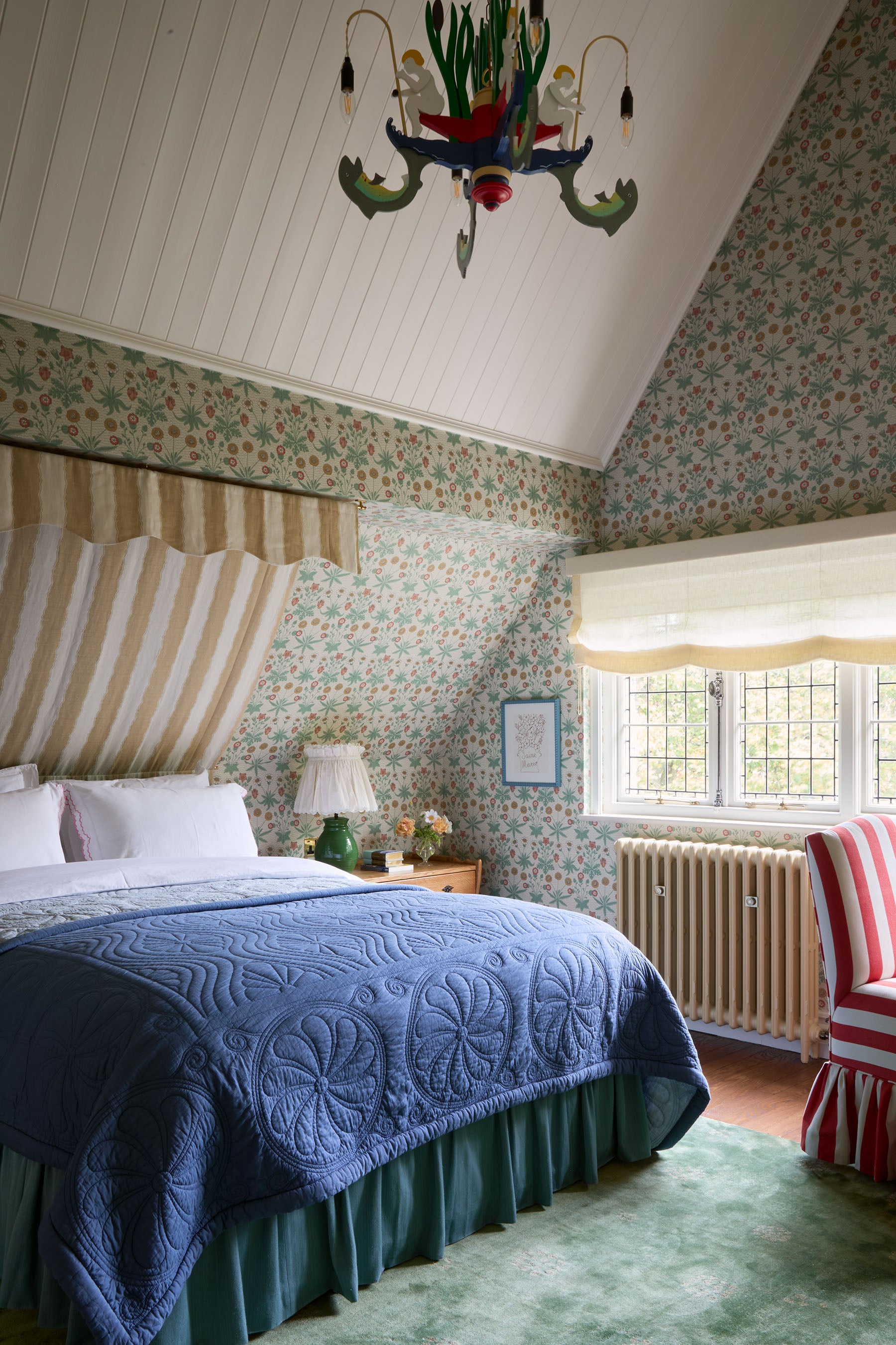
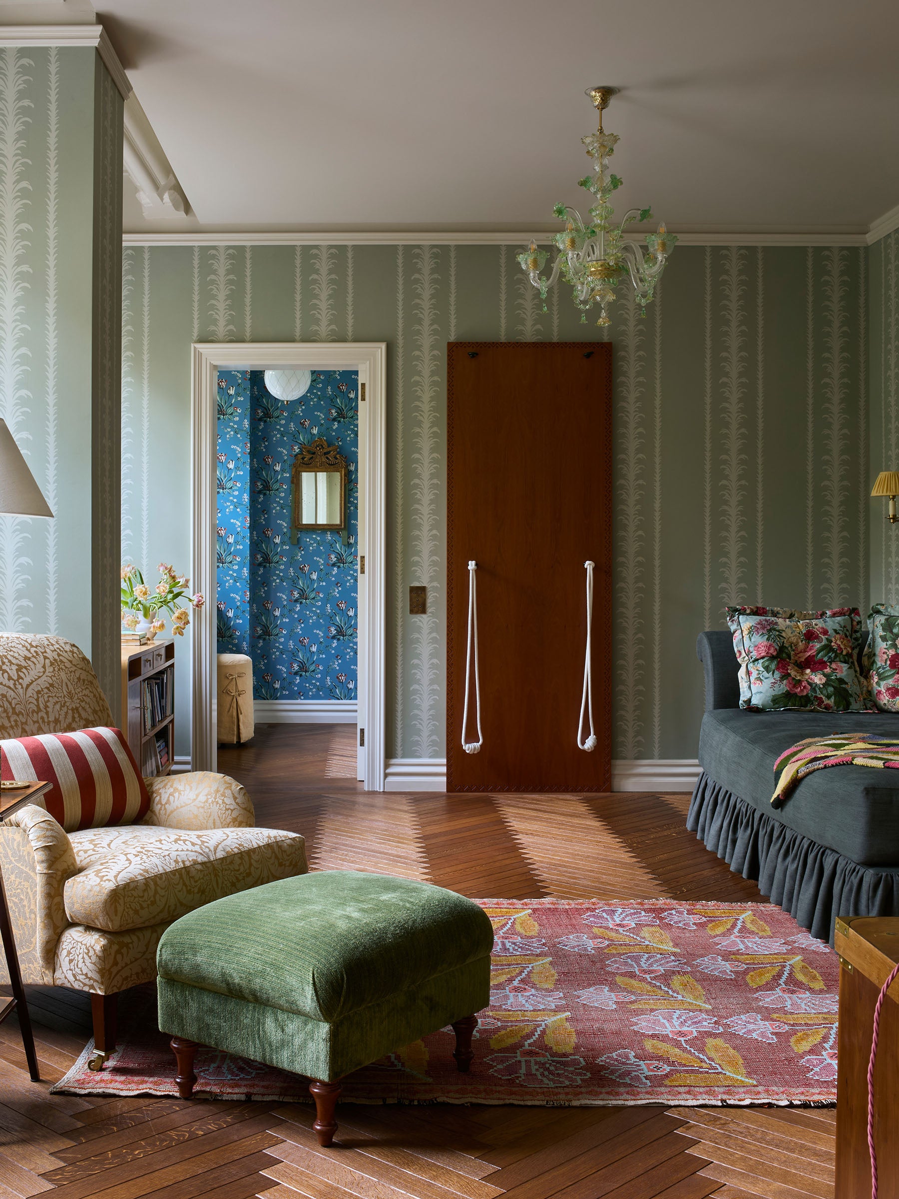
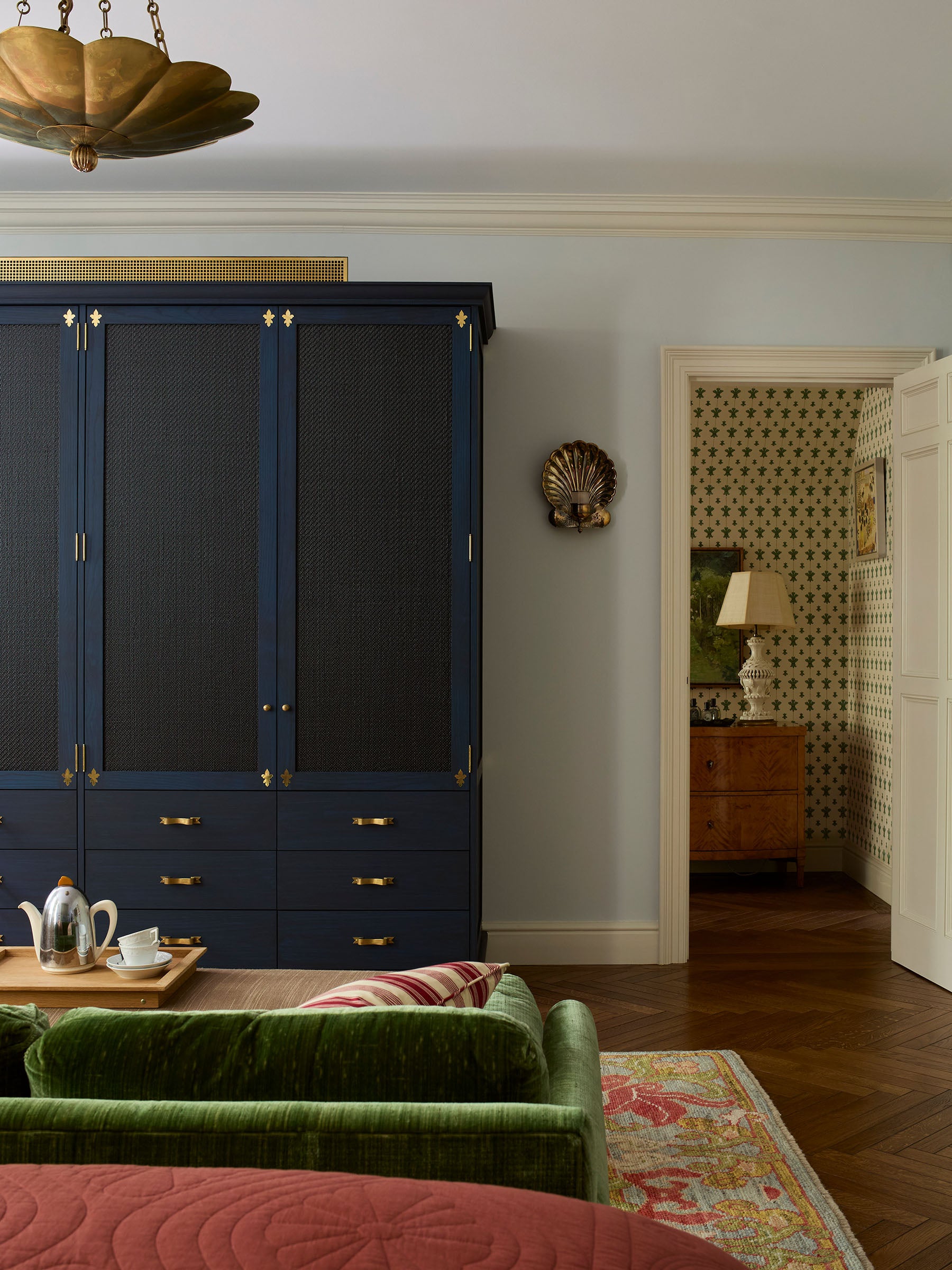
Most of the house has the original 1880s panelling which is wonderful but rather striking so we painted almost everything in the same chalkie off-white tone to make sure it felt light, easy and cohesive throughout. The top floor where the children have their bedrooms was a perfect place to indulge in some wallpaper however. The east gable room was made for this William Morris classic!
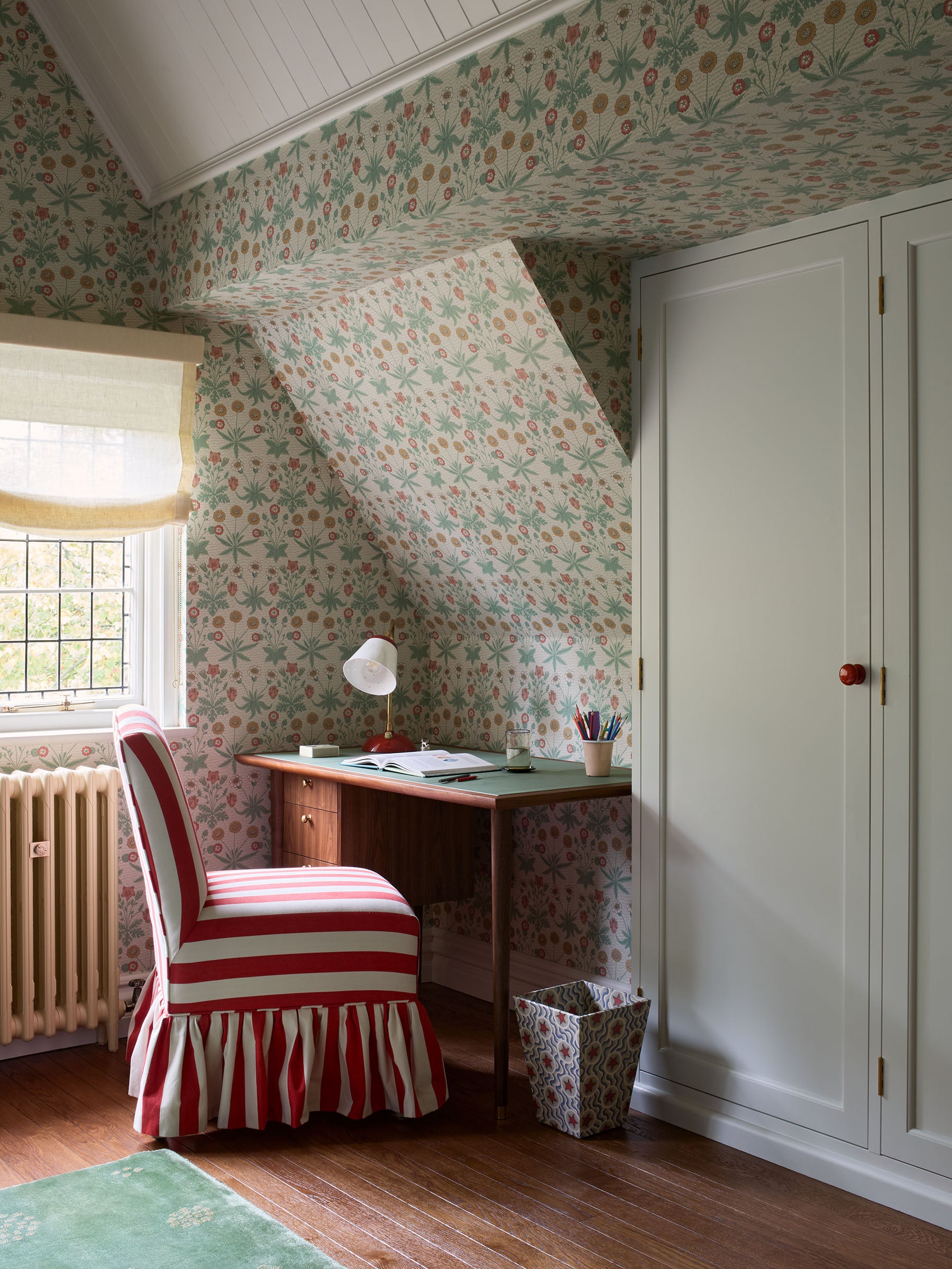
Most of the house has the original 1880s panelling which is wonderful but rather striking so we painted almost everything in the same chalkie off-white tone to make sure it felt light, easy and cohesive throughout. The top floor where the children have their bedrooms was a perfect place to indulge in some wallpaper however. The east gable room was made for this William Morris classic!
Most of the house has the original 1880s panelling which is wonderful but rather striking so we painted almost everything in the same chalkie off-white tone to make sure it felt light, easy and cohesive throughout. The top floor where the children have their bedrooms was a perfect place to indulge in some wallpaper however. The east gable room was made for this William Morris classic!
The west gable room (below), also covered in wallpaper. The gable attic rooms sit opposite one another and each is adorned with a hand painted, wooden Edward Lutyens chandelier. Here, rearing horses defend a lighthouse and in the other children are fishing amongst bullrushes, using the lightbulbs as bait. In fact, Lutyens will most likely have walked around the house when he was a young architect. The lights are some of our favourites regardless of history, but we also added these imaginative, odd pieces as an homage to him and his contribution to architecture and decorative arts at the turn of the last century.

Photography: Beata Heuman. Completed 2024. London.