Lakeside Home
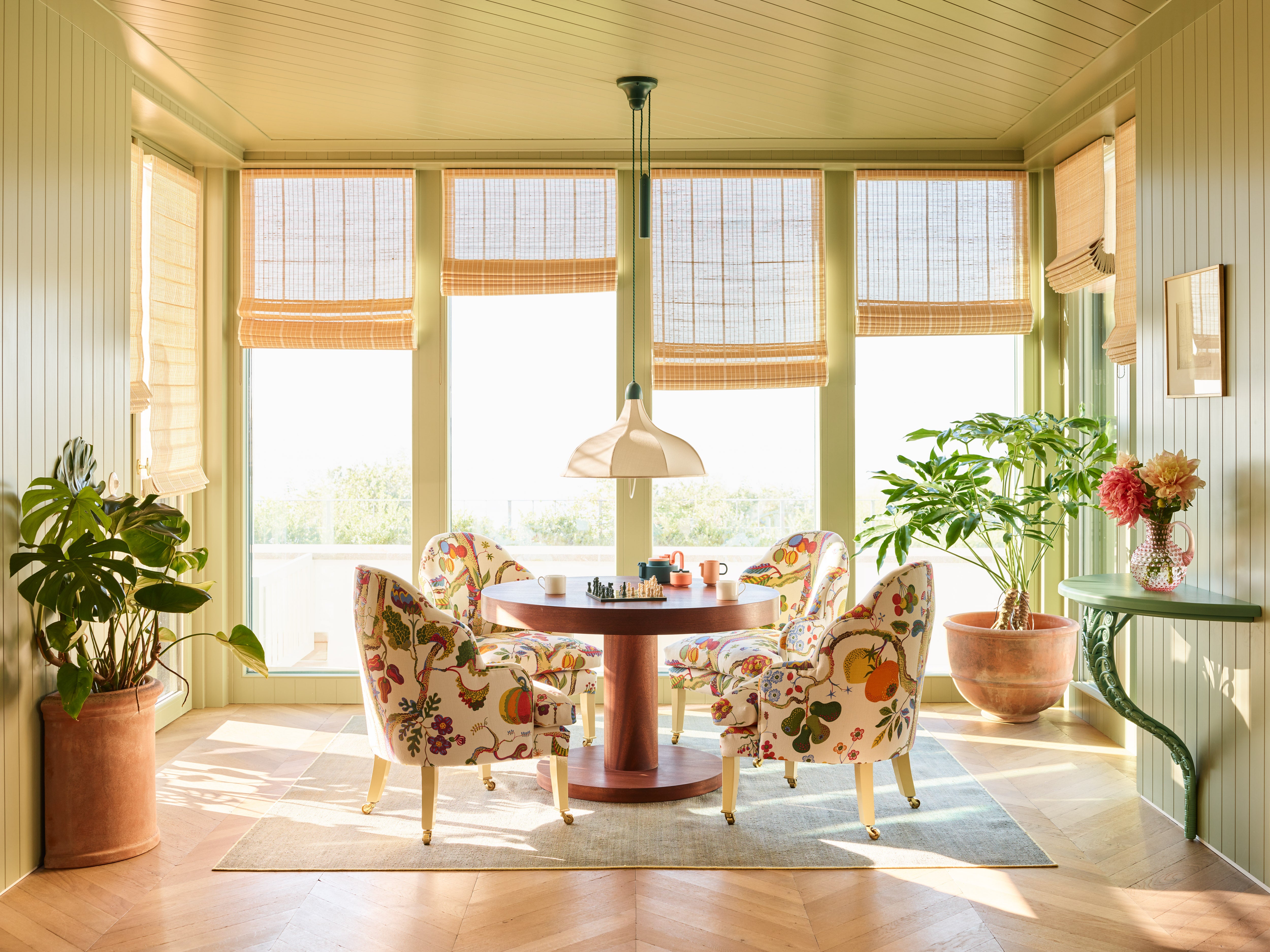
This project was a new-build. Striking a balance between introducing a sense of tradition whilst staying true to the house's newness was a fun challenge. We kept lines clean and simple and added depth with materials such as boarded walls and a rustic chevron floor.
See More
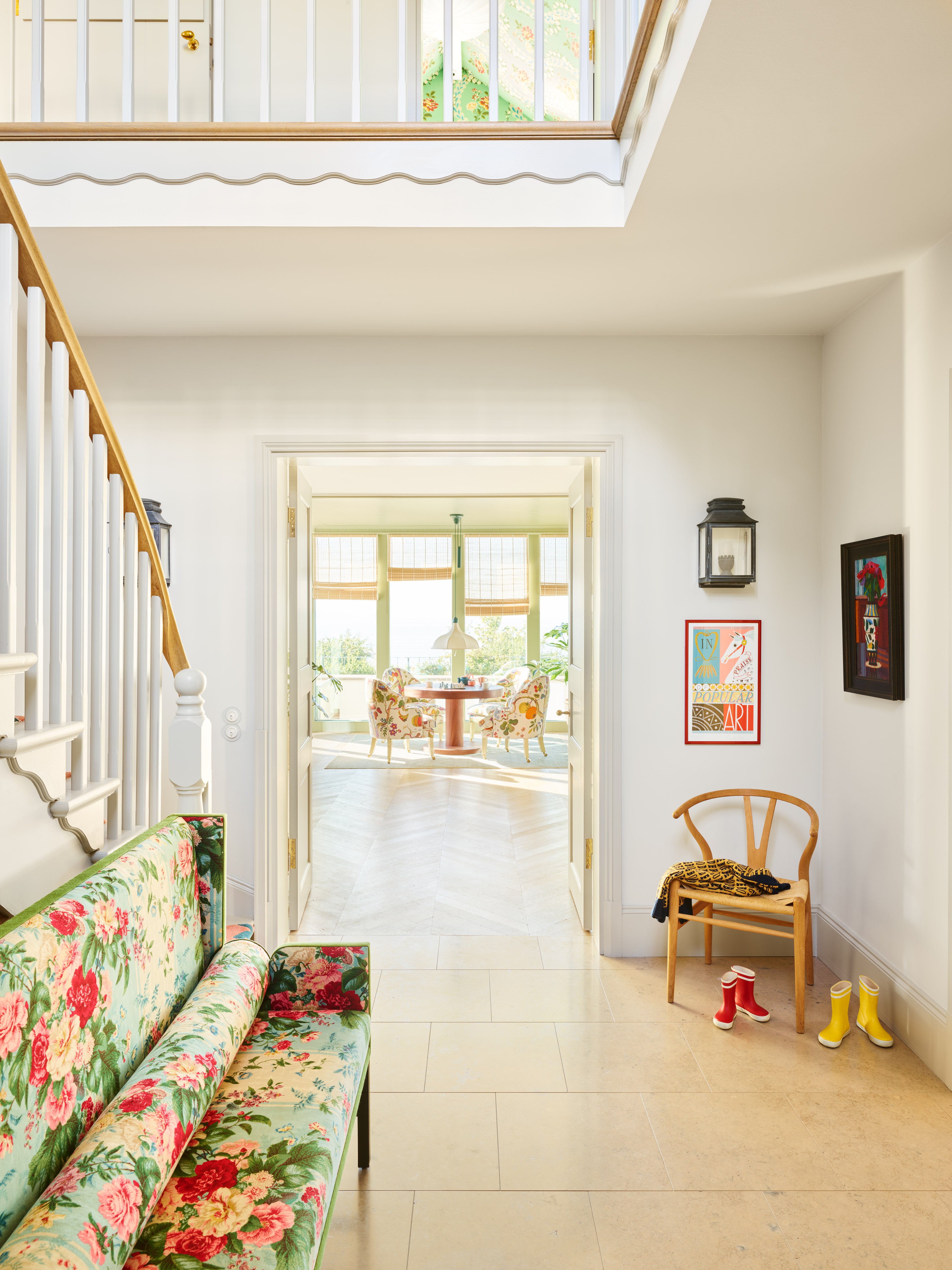
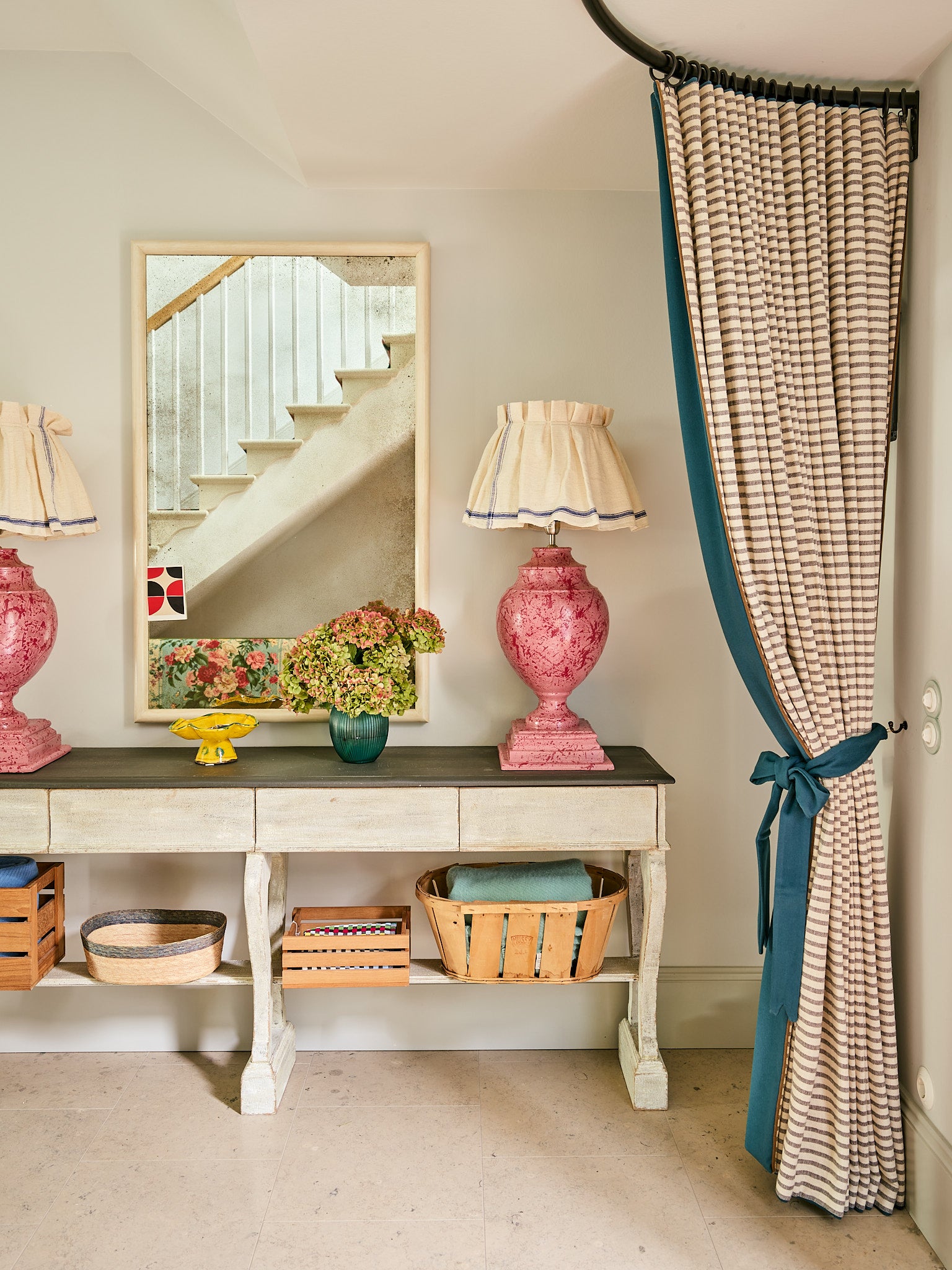
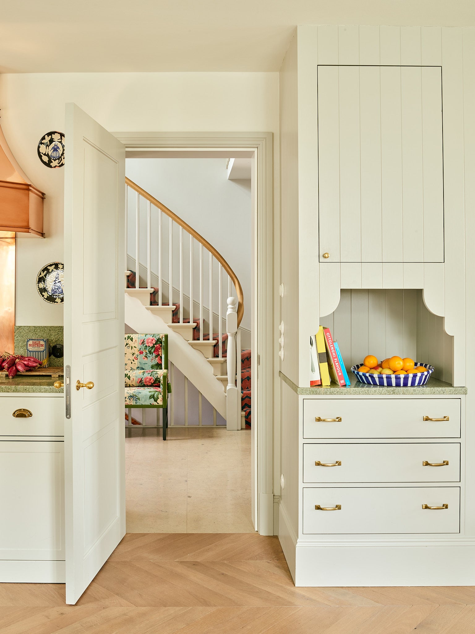
“Heuman's eye for decorative detail is impactful in its restraint and sets a whimsical and charming scene throughout.”Jane Keltner de Valle, Architectural Digest (May 2021).
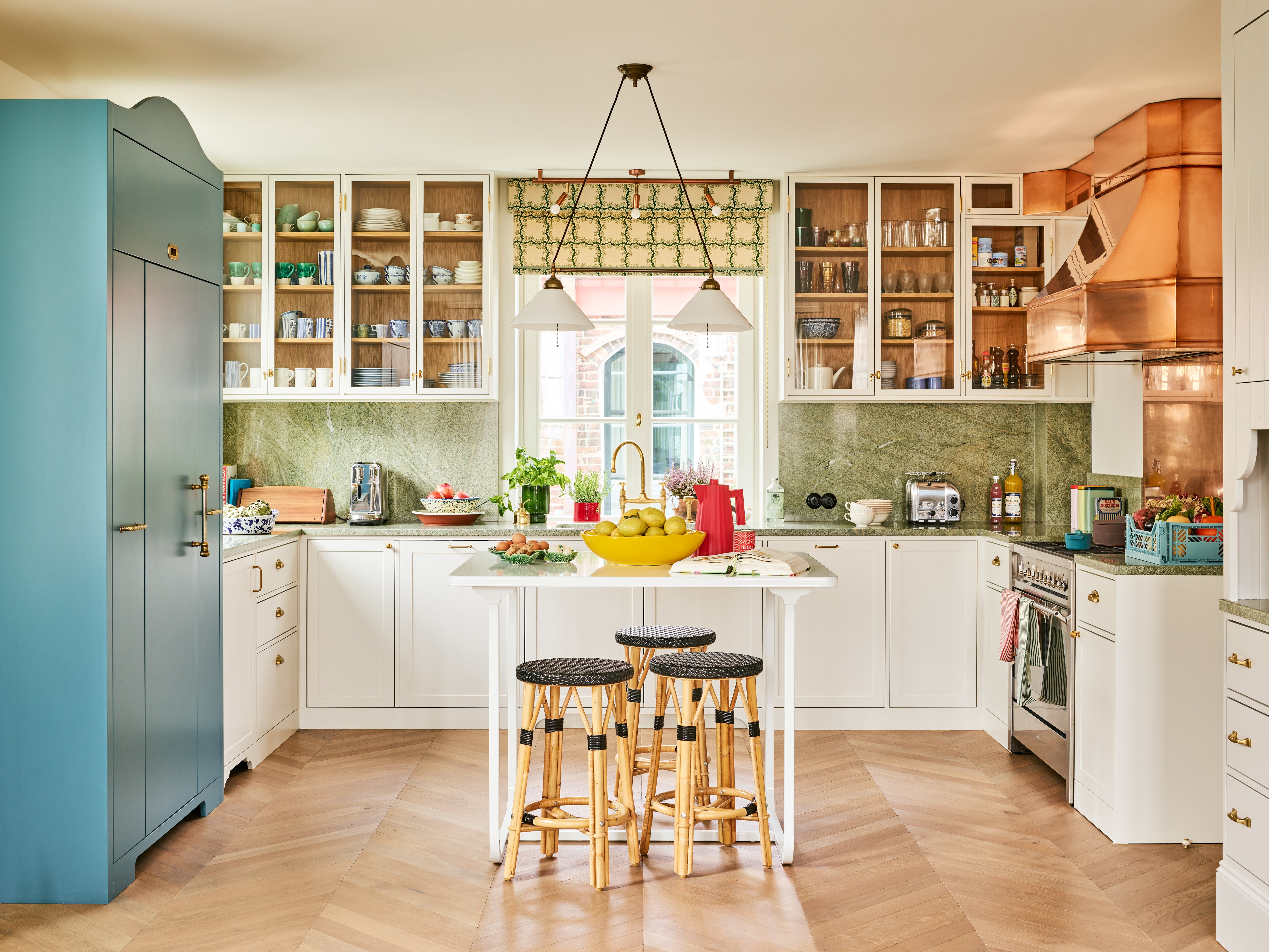
The open plan living (above and below) is one large U-shaped space. The back wall is lined in bookshelves on one side and the kitchen on the other. We placed an antique Swedish stove (kakelugn) diagonally on one corner and a built a cabinet for crockery by the dining table on the other. This softens what would have otherwise been a sharp edge.
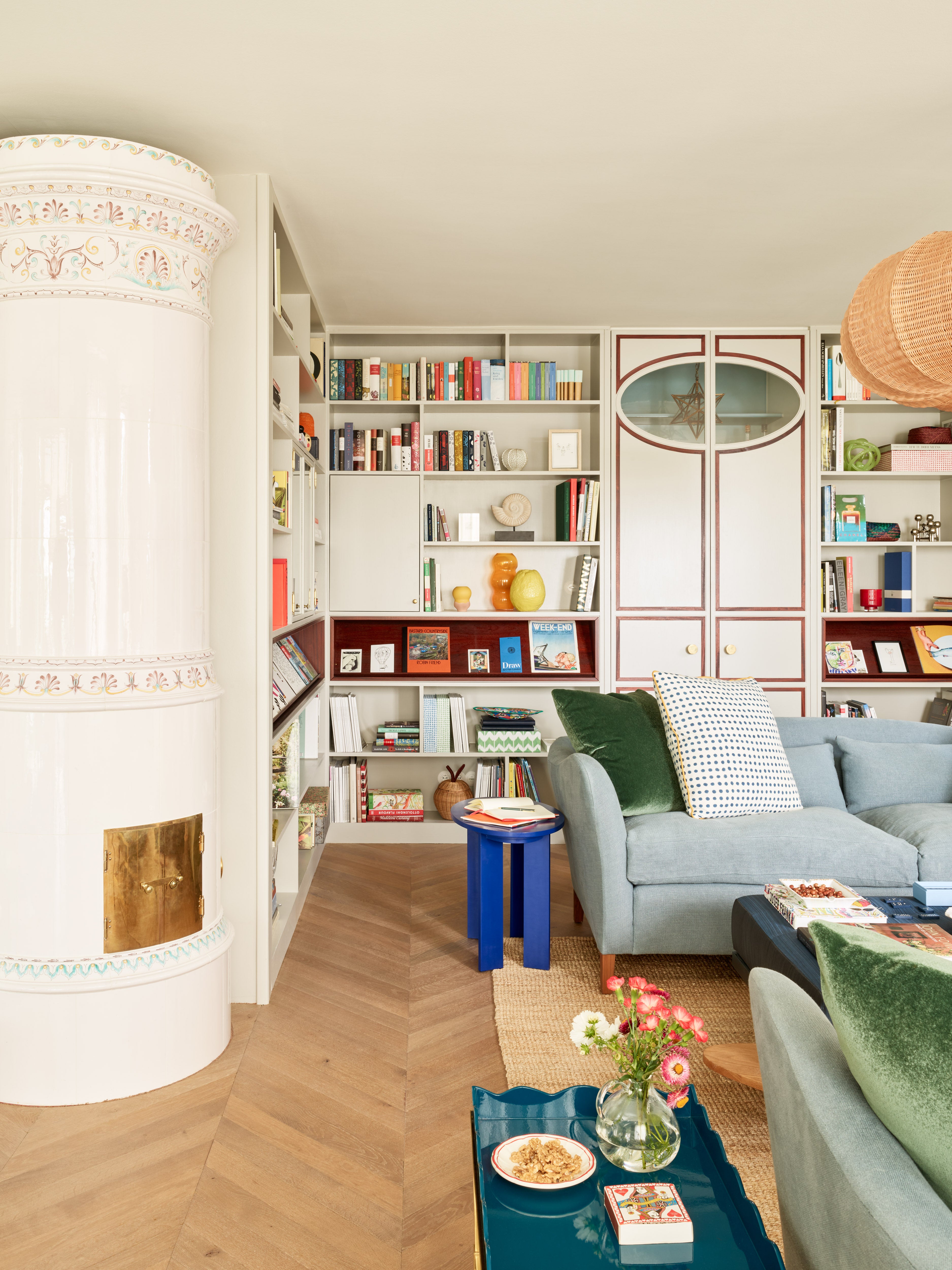
The open plan living (above and below) is one large U-shaped space. The back wall is lined in bookshelves on one side and the kitchen on the other. We placed an antique Swedish stove (kakelugn) diagonally on one corner and a built a cabinet for crockery by the dining table on the other. This softens what would have otherwise been a sharp edge.
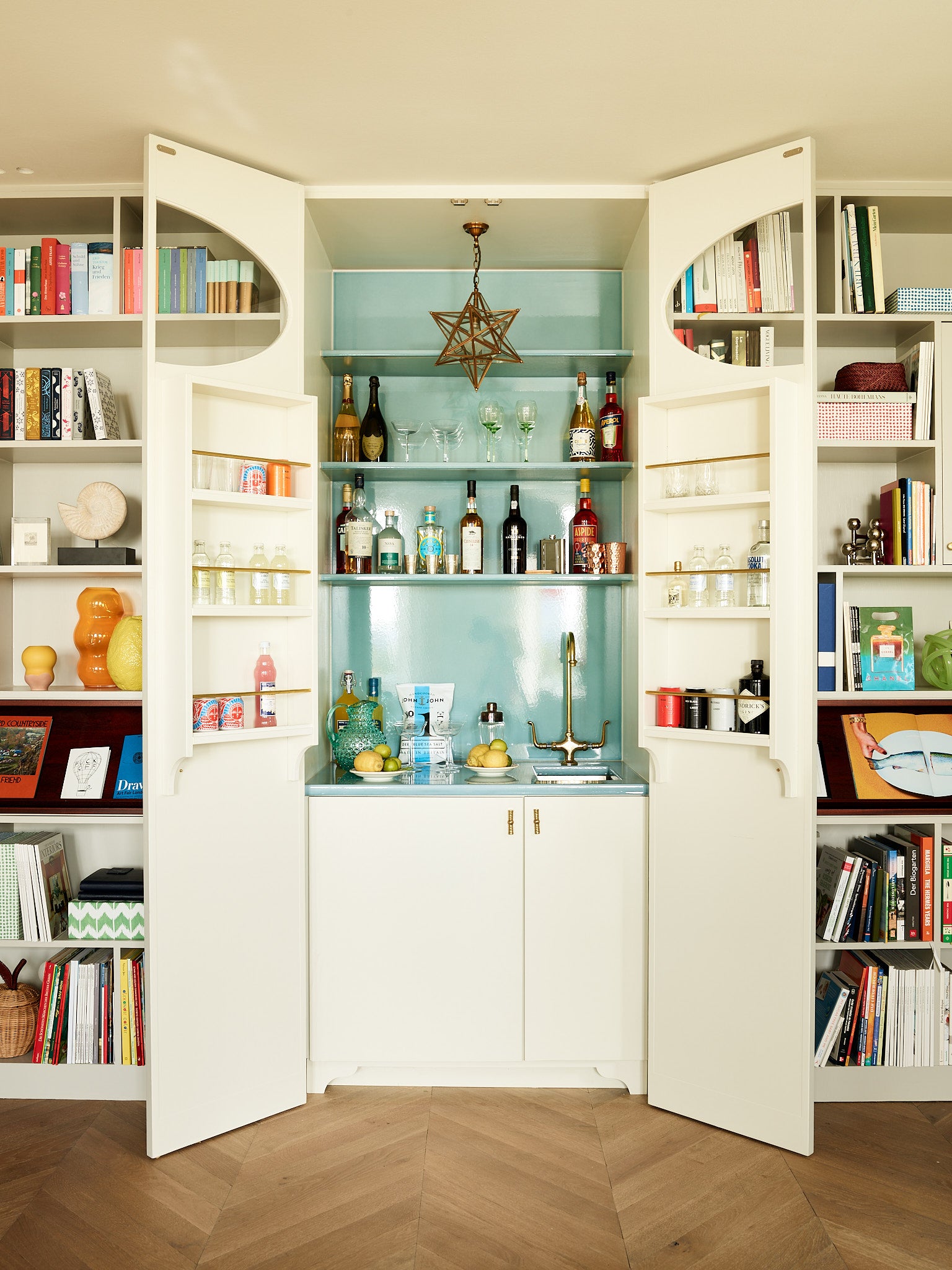
The open plan living (above and below) is one large U-shaped space. The back wall is lined in bookshelves on one side and the kitchen on the other. We placed an antique Swedish stove (kakelugn) diagonally on one corner and a built a cabinet for crockery by the dining table on the other. This softens what would have otherwise been a sharp edge.
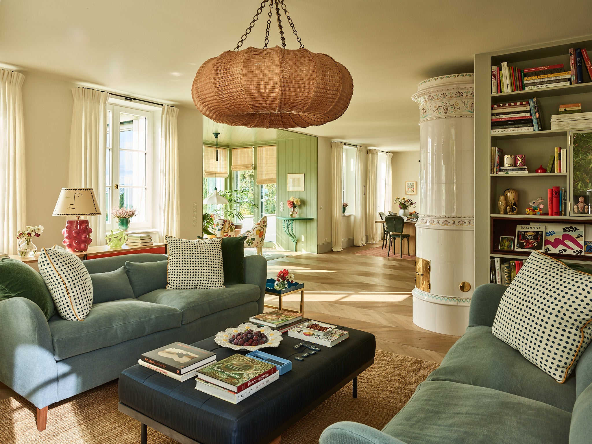
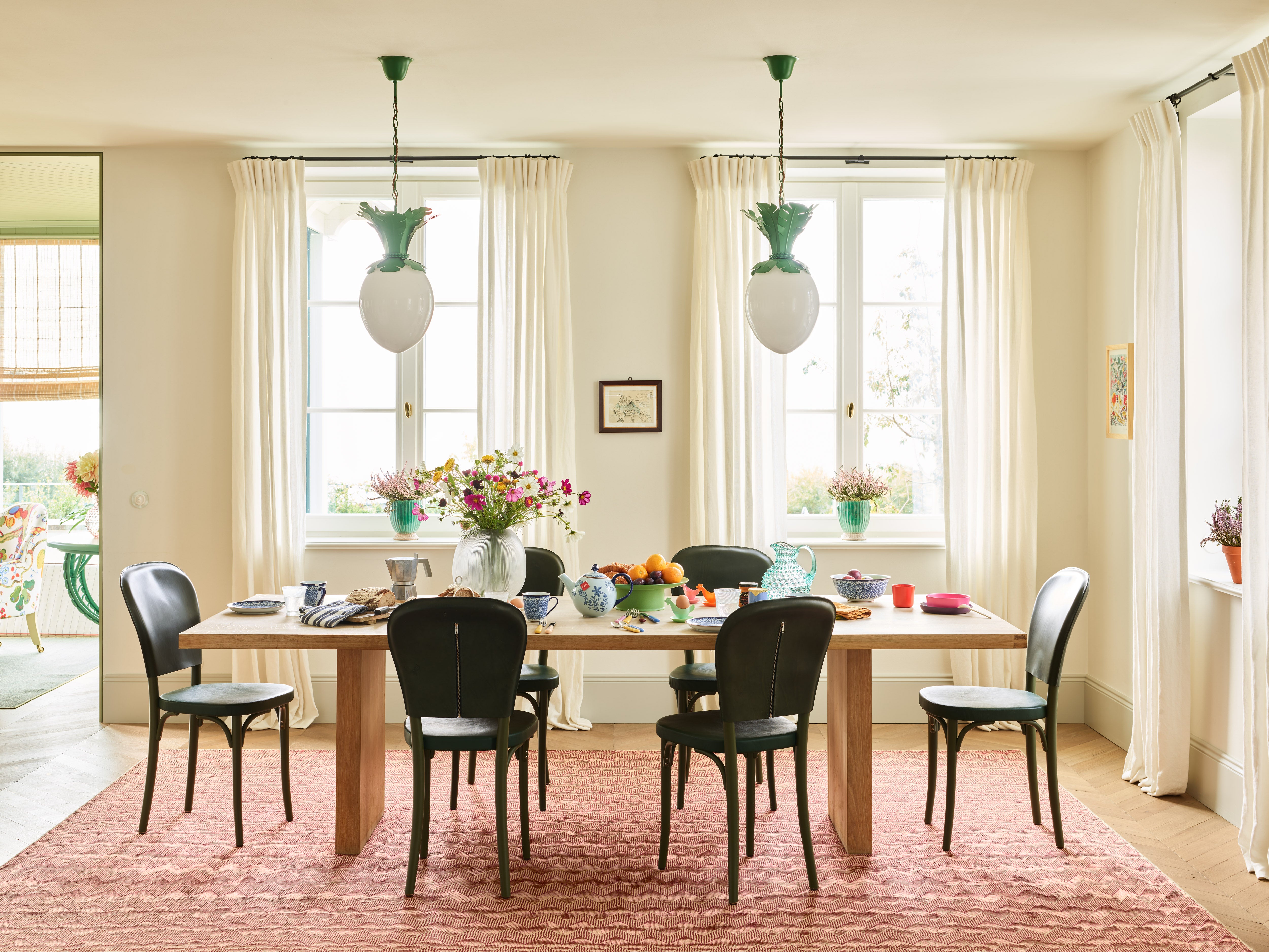
We opted against introducing cornicing in the house as it seemed more honest without. It gave us an opportunity to add long, flowing curtains instead, which could run the entire height of the room. A pair of our Dodo Egg Lights hang above the table.
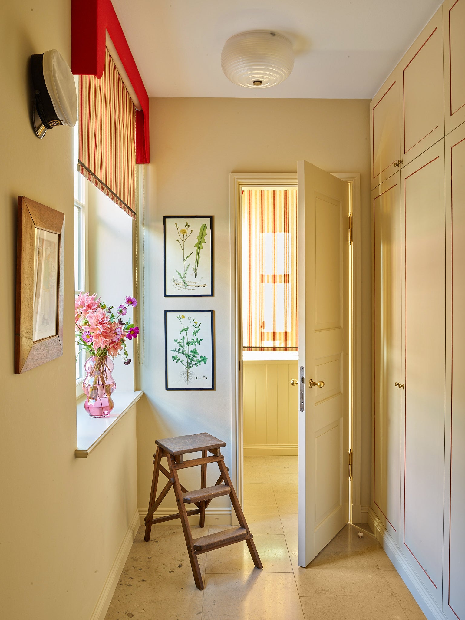
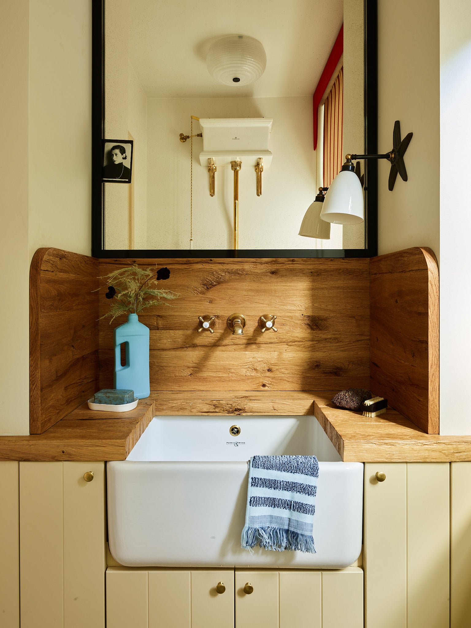
“It's the first time we've done a new build, and it was so nice to have that trust and be involved to that extent. [Out of the projects we've done] this turned out the most like if I'd done it for myself. I feel very at home there.”Beata Heuman, Architectural Digest (May 2021).
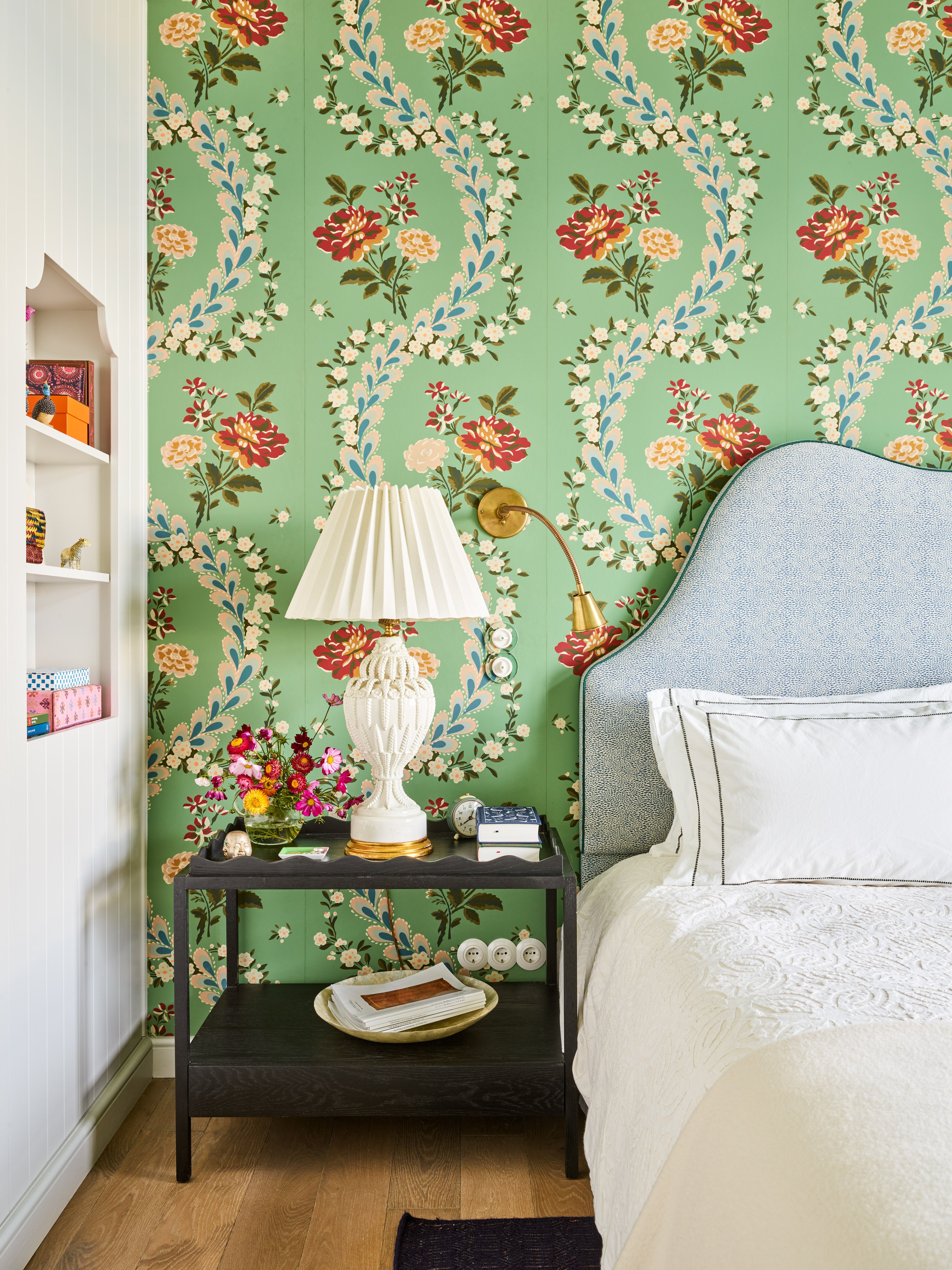
The bedroom was covered in an 18th century French hand-blocked paper. The height of the room was further emphasized by bringing the print up onto the pitched ceiling.
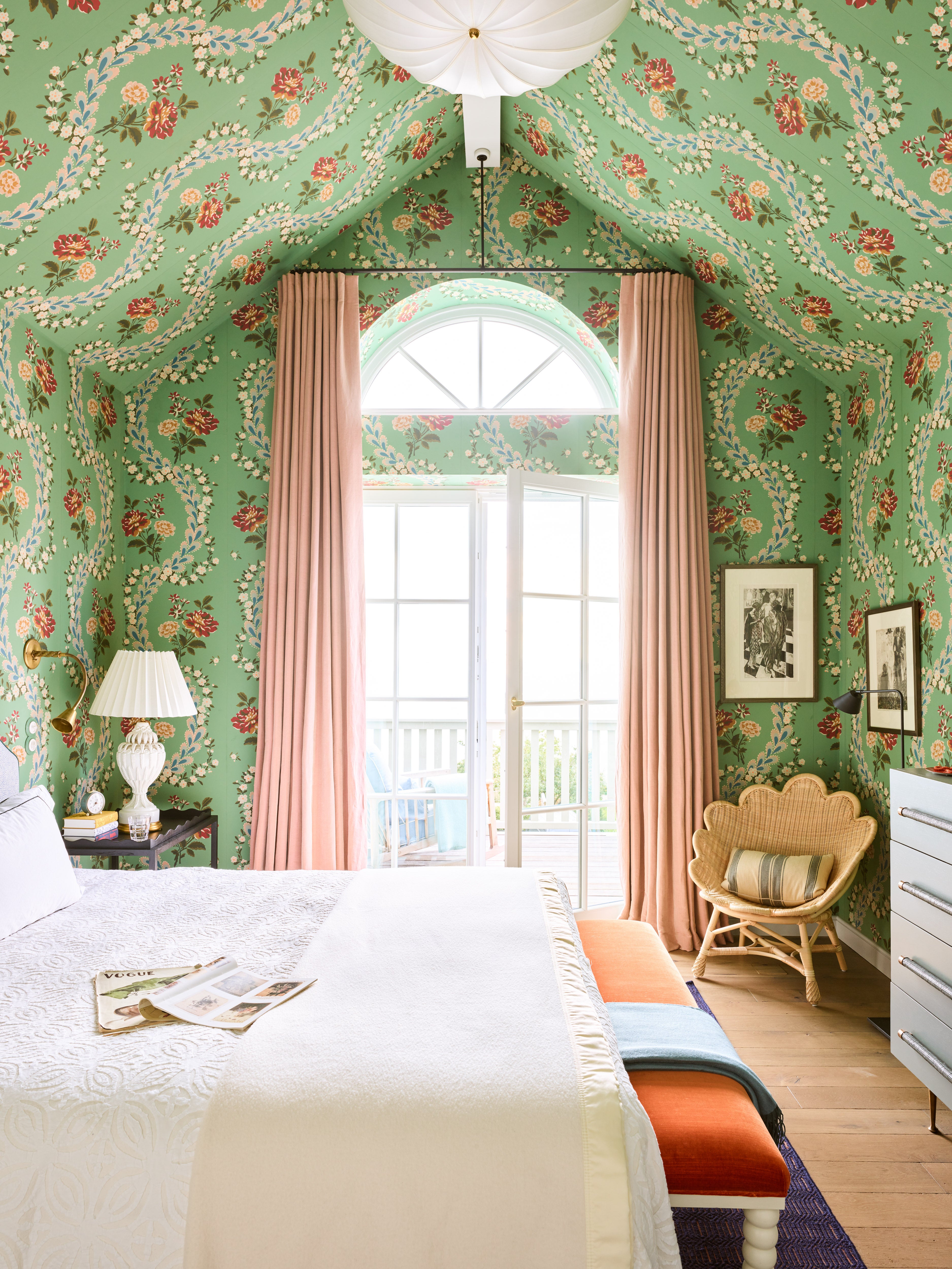
The bedroom was covered in an 18th century French hand-blocked paper. The height of the room was further emphasized by bringing the print up onto the pitched ceiling.
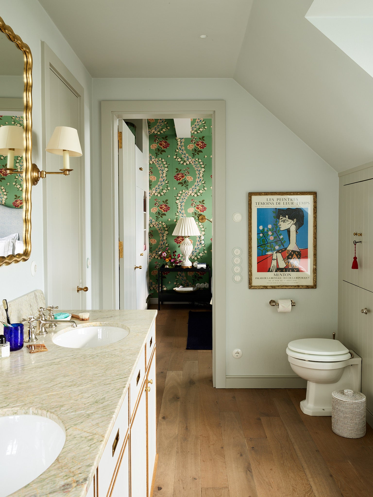
The bedroom was covered in an 18th century French hand-blocked paper. The height of the room was further emphasized by bringing the print up onto the pitched ceiling.
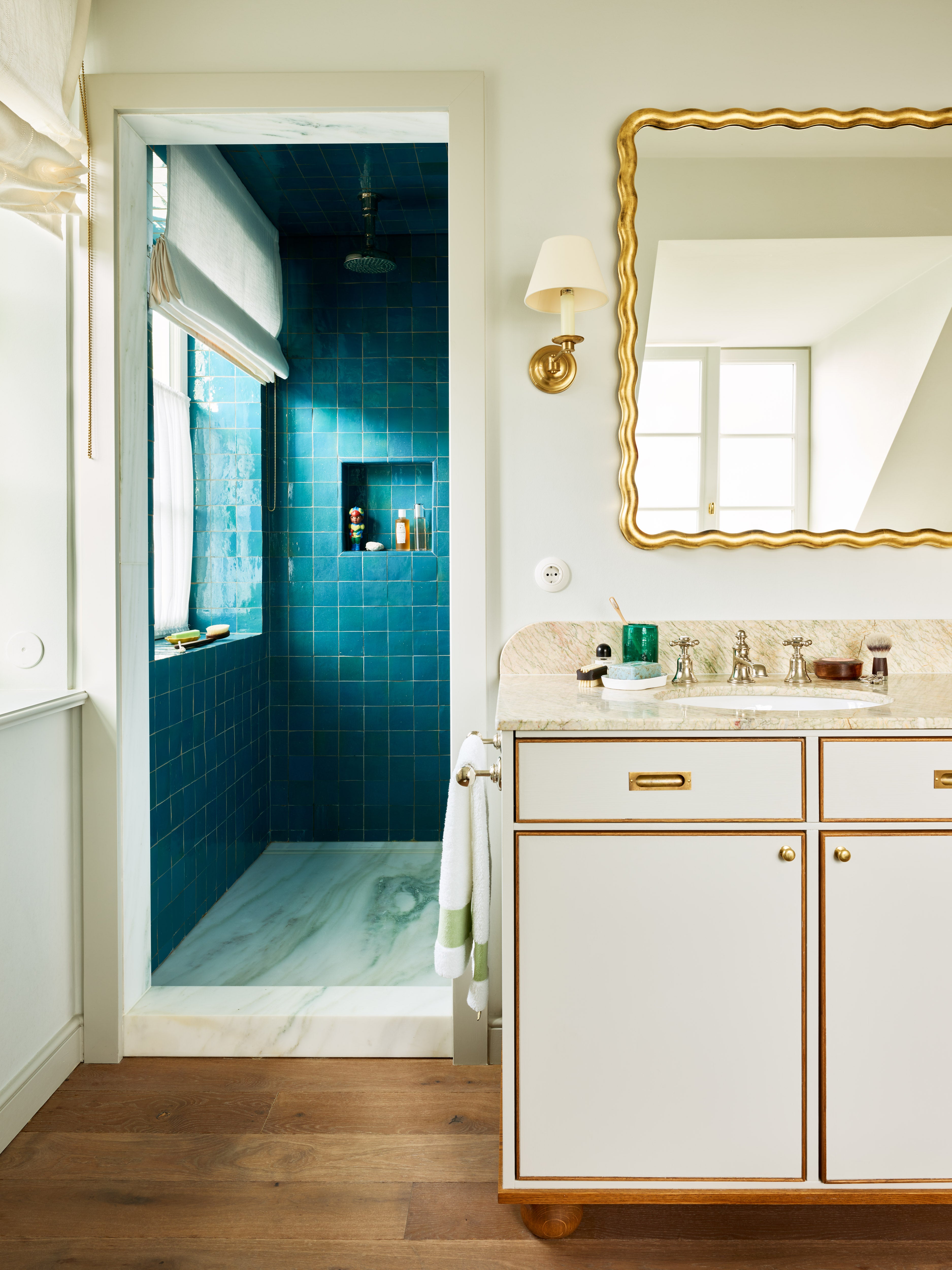
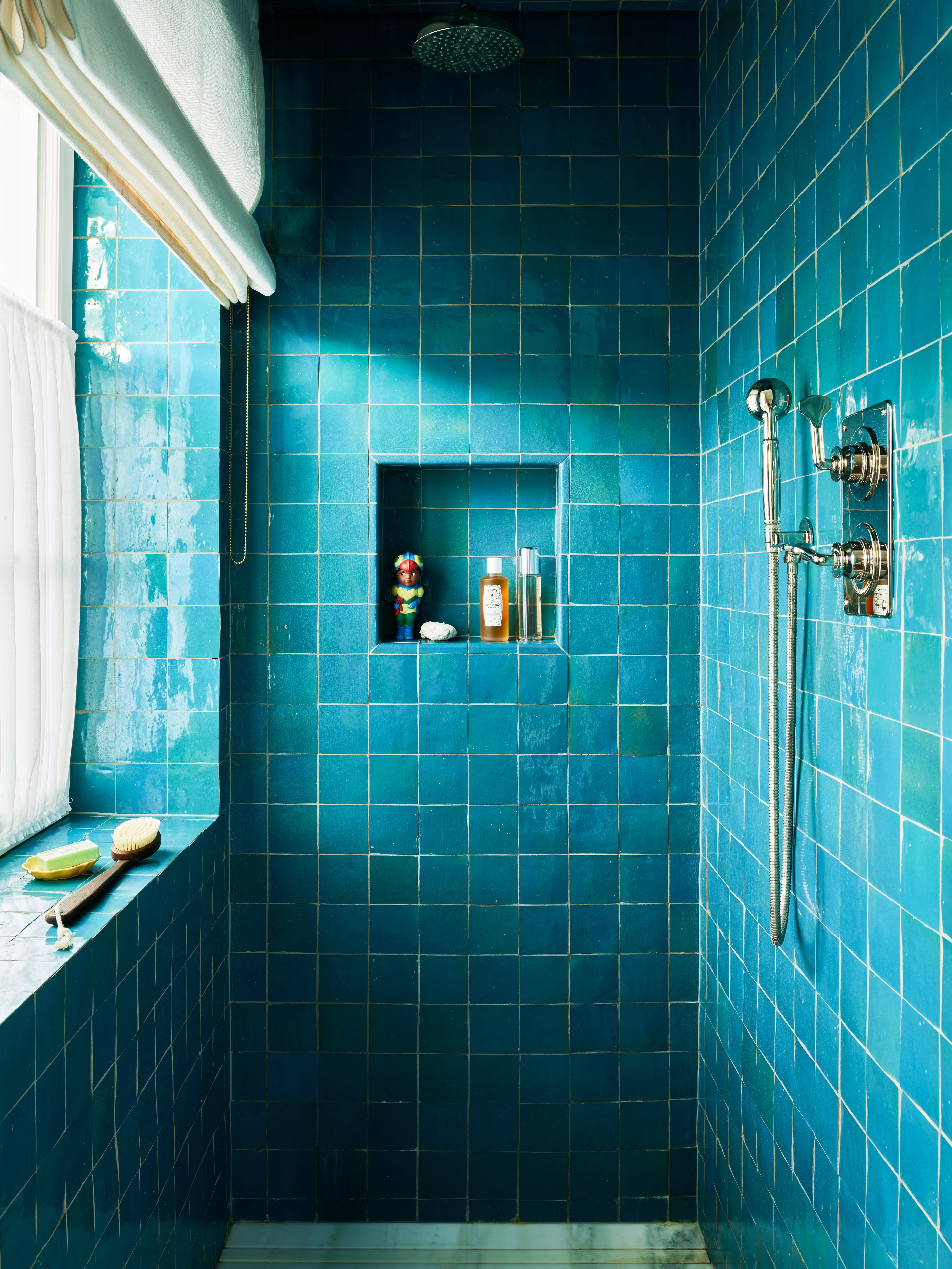
The shower (above) was covered in teal-coloured zellige tiles. The surface of the tiles undulates and their colour shift from green to blue, giving the feeling of the deep blue sea. The vanity unit was made bespoke to get as much storage as possible around the basins.
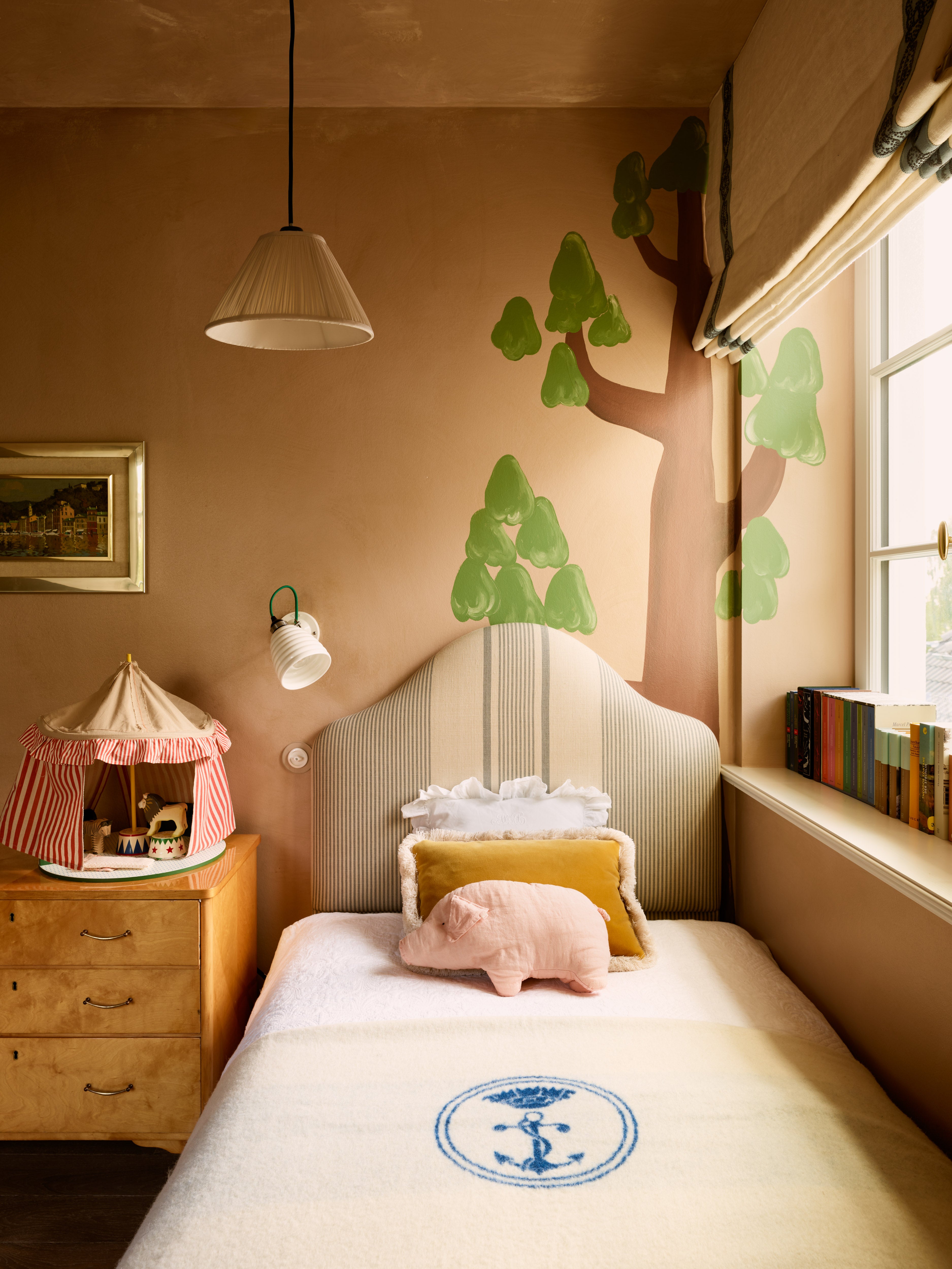
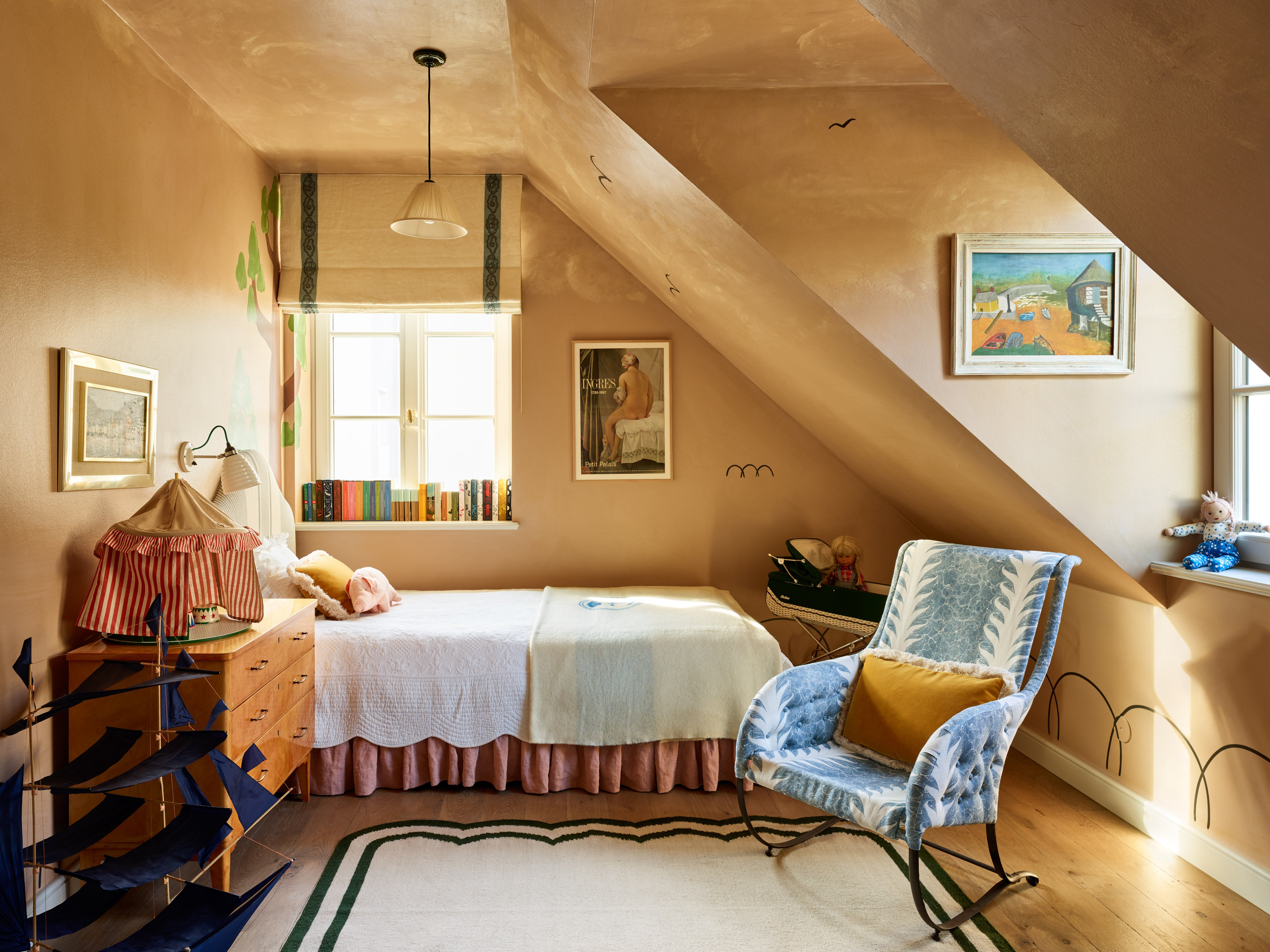
Photographs: Robert Reiger. Completed 2020.

