Nantucket Summer House
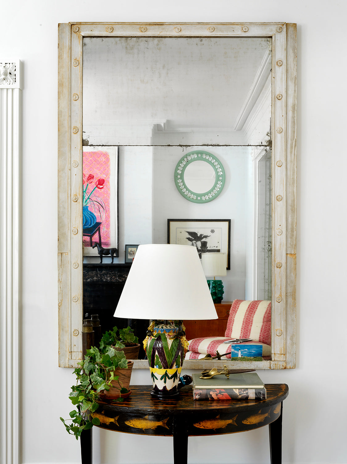
A beautiful eighteenth-century clapboard house in Nantucket. It was important to respect the building's history without making it feel like a museum, allowing for continual change over time. As a vacation home, it also needed to be simple and easy.
See More
“It is particularly important as a designer to allow for the possibility of change, because the selections we make are curated and normally put together in a relatively short amount of time. But whoever you are, your home will continue to evolve as time passes.''Beata Heuman 'Every Room Should Sing' (Rizzoli, 2021).
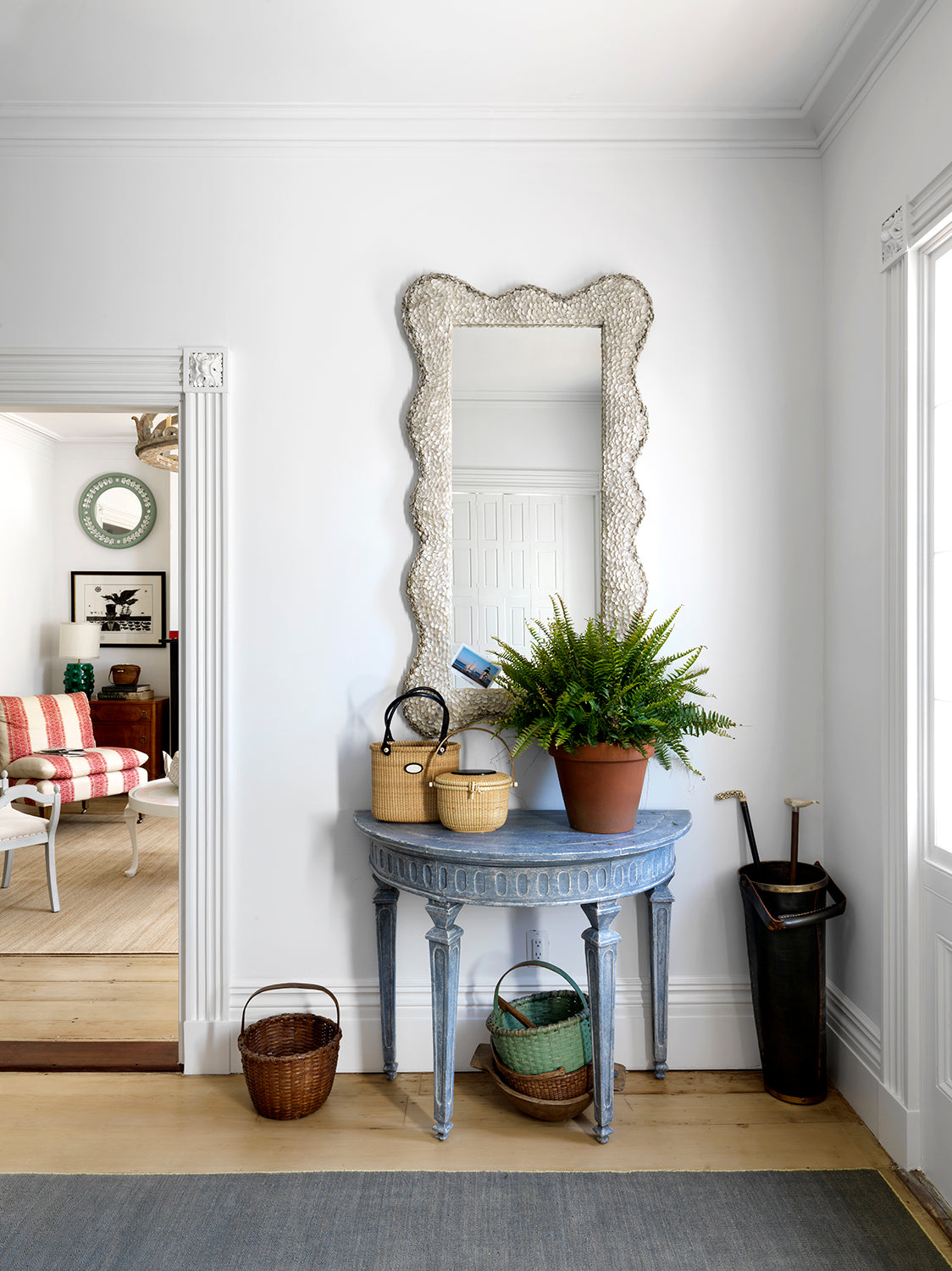
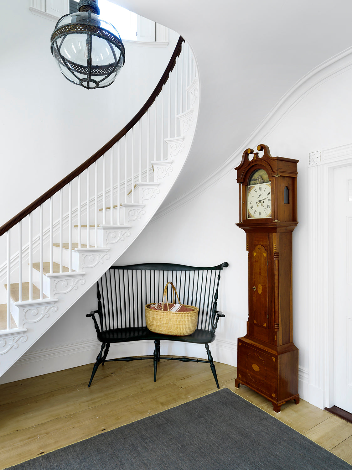
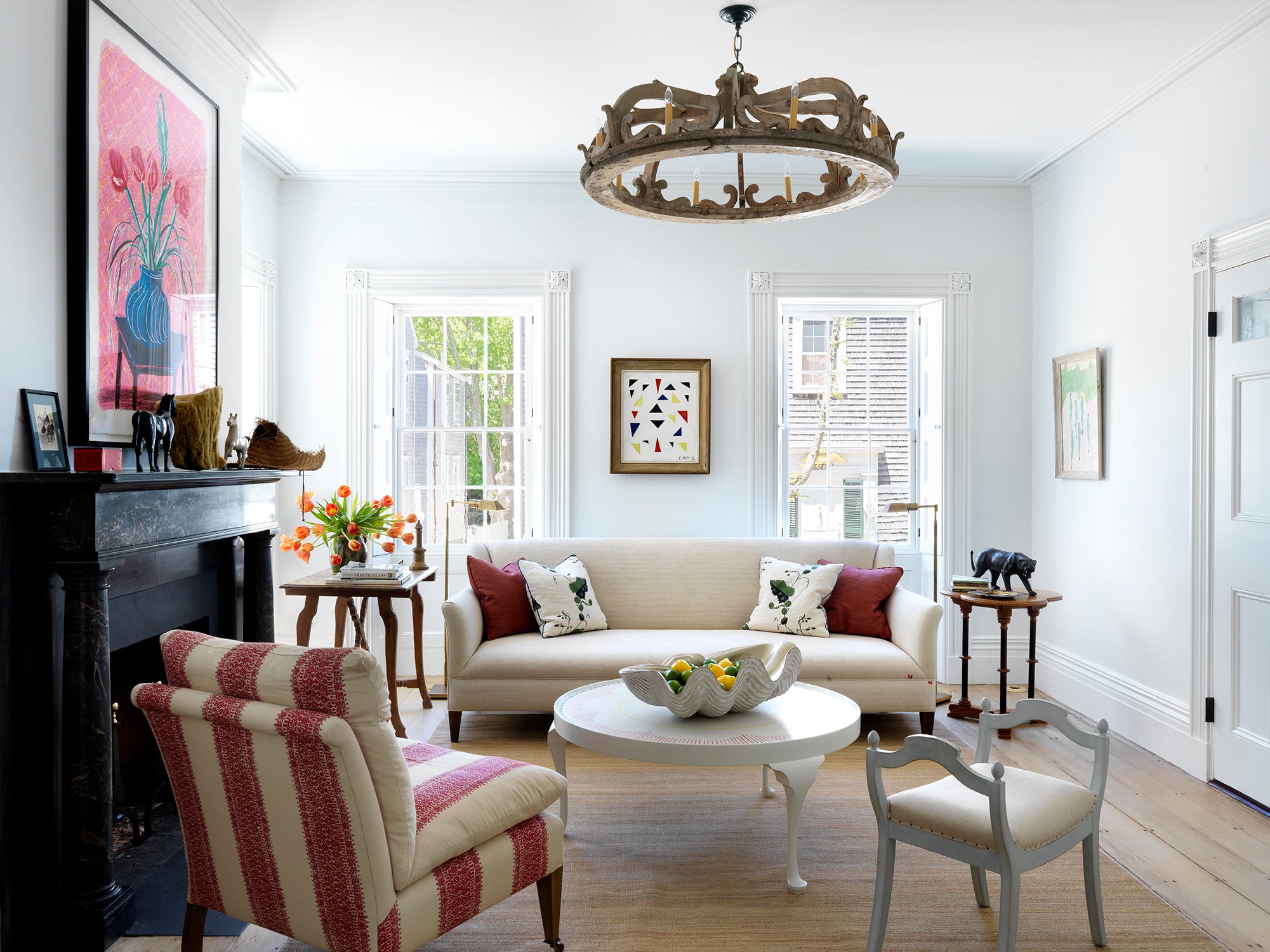
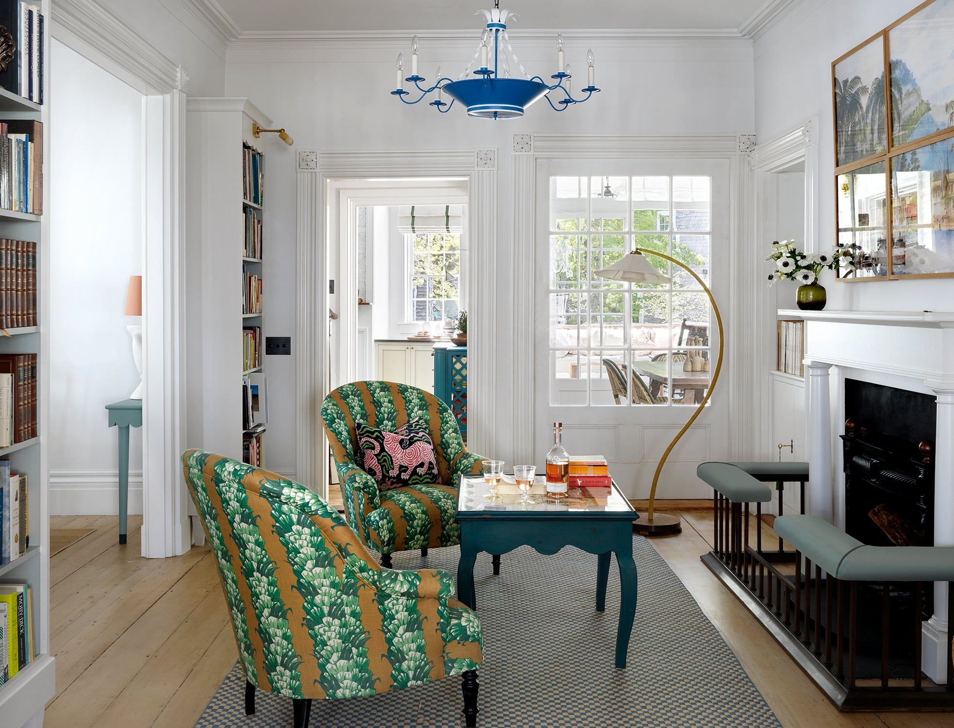
All original features such as door surrounds and windows were faithfully restored. The palette is calm and all walls are white, but there is still some theatre in the expression. We bought a 17th century bed canopy and turned it into a chandelier (left). The living room leads to the library (below) and then onto the dining room.
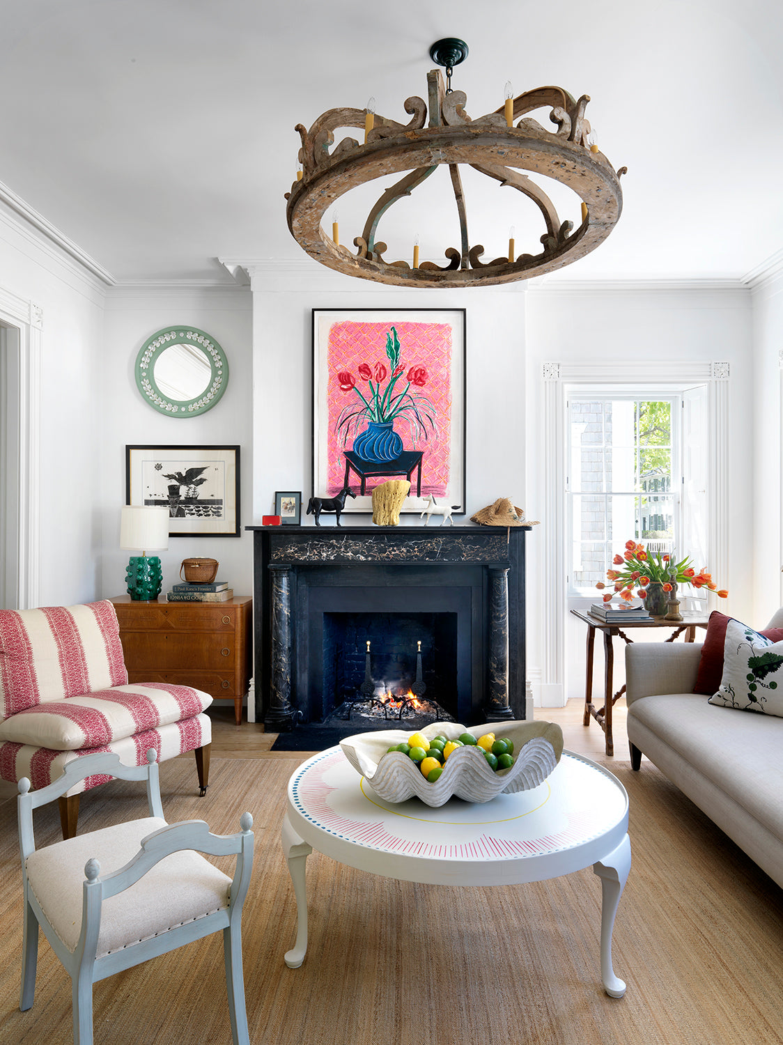
All original features such as door surrounds and windows were faithfully restored. The palette is calm and all walls are white, but there is still some theatre in the expression. We bought a 17th century bed canopy and turned it into a chandelier (left). The living room leads to the library (below) and then onto the dining room.
All original features such as door surrounds and windows were faithfully restored. The palette is calm and all walls are white, but there is still some theatre in the expression. We bought a 17th century bed canopy and turned it into a chandelier (left). The living room leads to the library (below) and then onto the dining room.
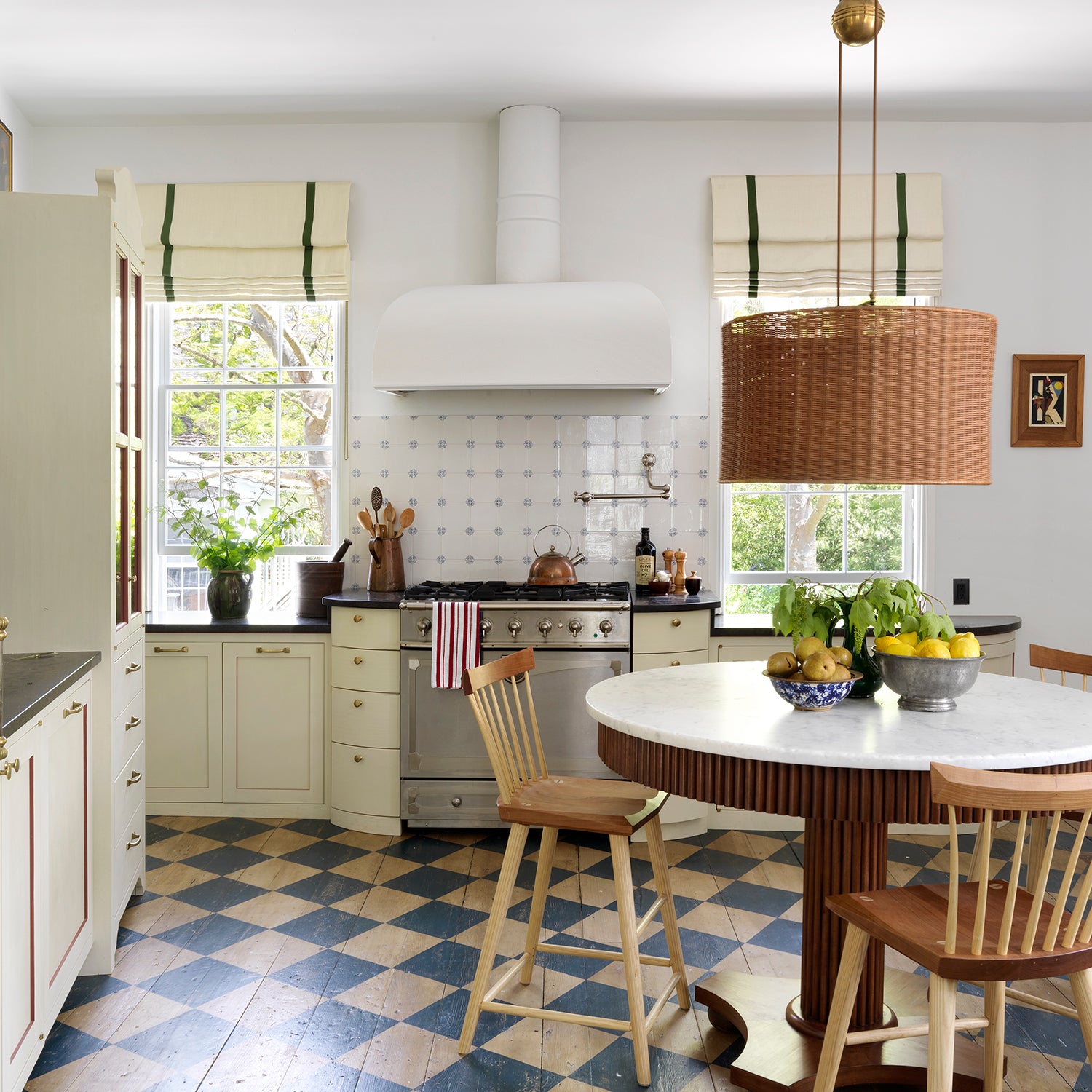
The kitchen (below & left) proved a challenge as all its walls are at an angle. The room's five windows are wonderful, but take up a lot of space with some set lower than a comfortable worktop height. We let the geometry guide us. The key thing was having a round table in the middle, which makes the room work whatever angle you look at it. The painted floor also helps open up the direction of the space.
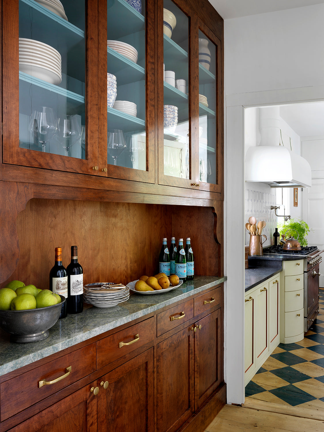
The kitchen (below & left) proved a challenge as all its walls are at an angle. The room's five windows are wonderful, but take up a lot of space with some set lower than a comfortable worktop height. We let the geometry guide us. The key thing was having a round table in the middle, which makes the room work whatever angle you look at it. The painted floor also helps open up the direction of the space.
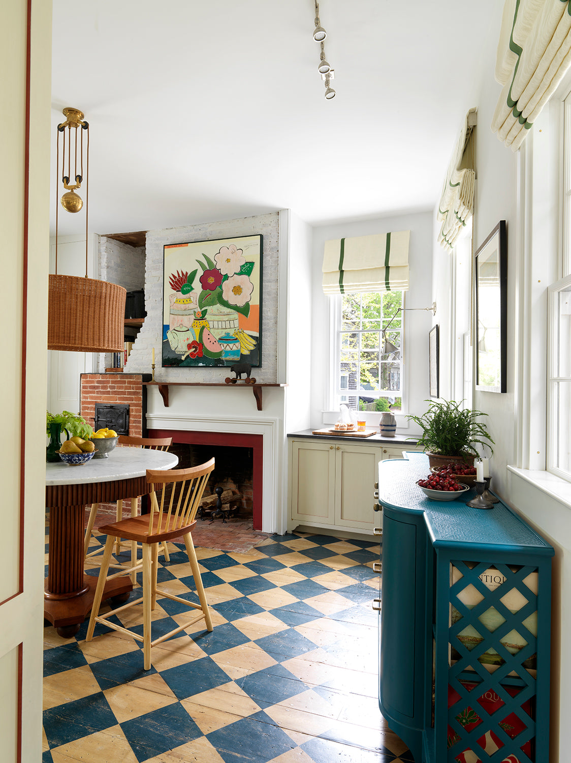
The kitchen (below & left) proved a challenge as all its walls are at an angle. The room's five windows are wonderful, but take up a lot of space with some set lower than a comfortable worktop height. We let the geometry guide us. The key thing was having a round table in the middle, which makes the room work whatever angle you look at it. The painted floor also helps open up the direction of the space.
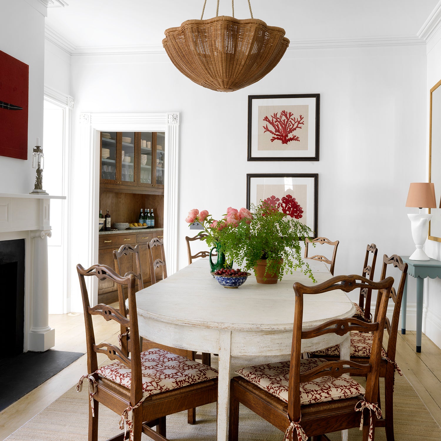
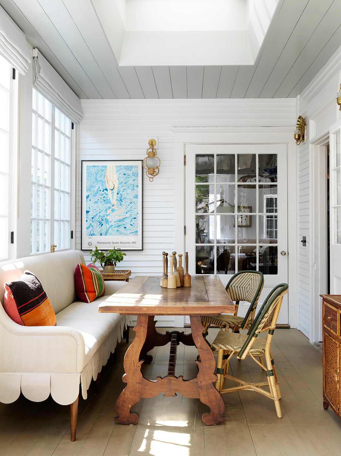
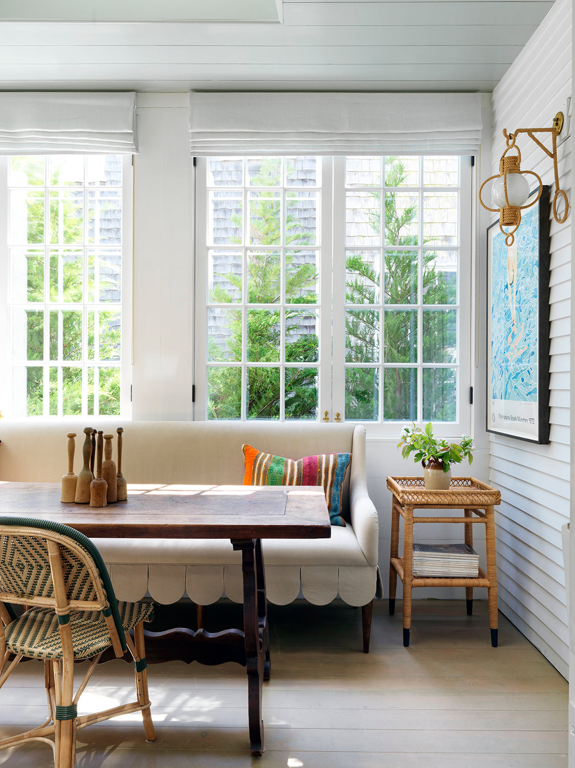
The breakfast room (below) was an addition. It leads to the terrace and in a sense sits outside of the main house. We wanted to emphasise this by cladding the walls in clapboards. Through the big glass door you look back into the library.
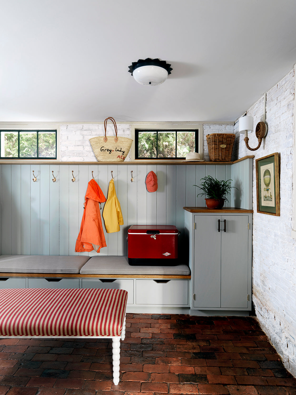
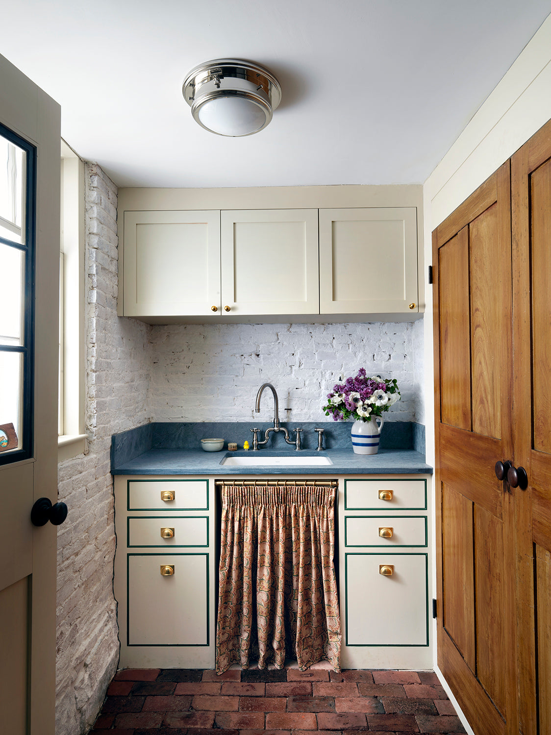
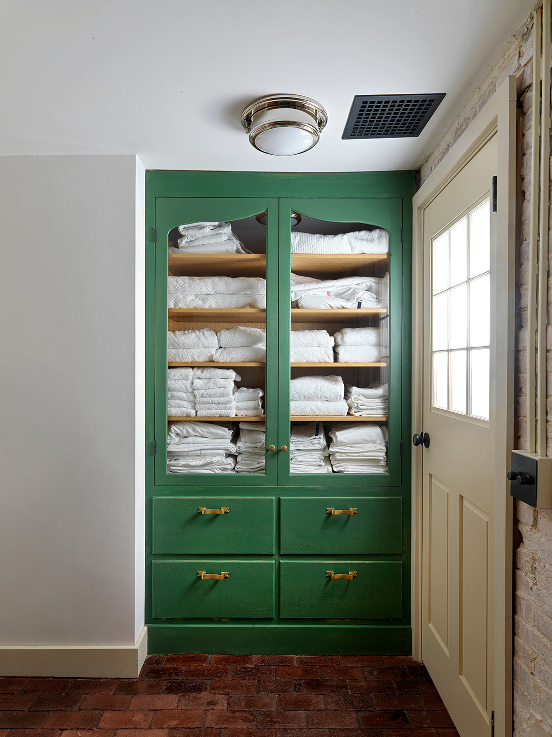
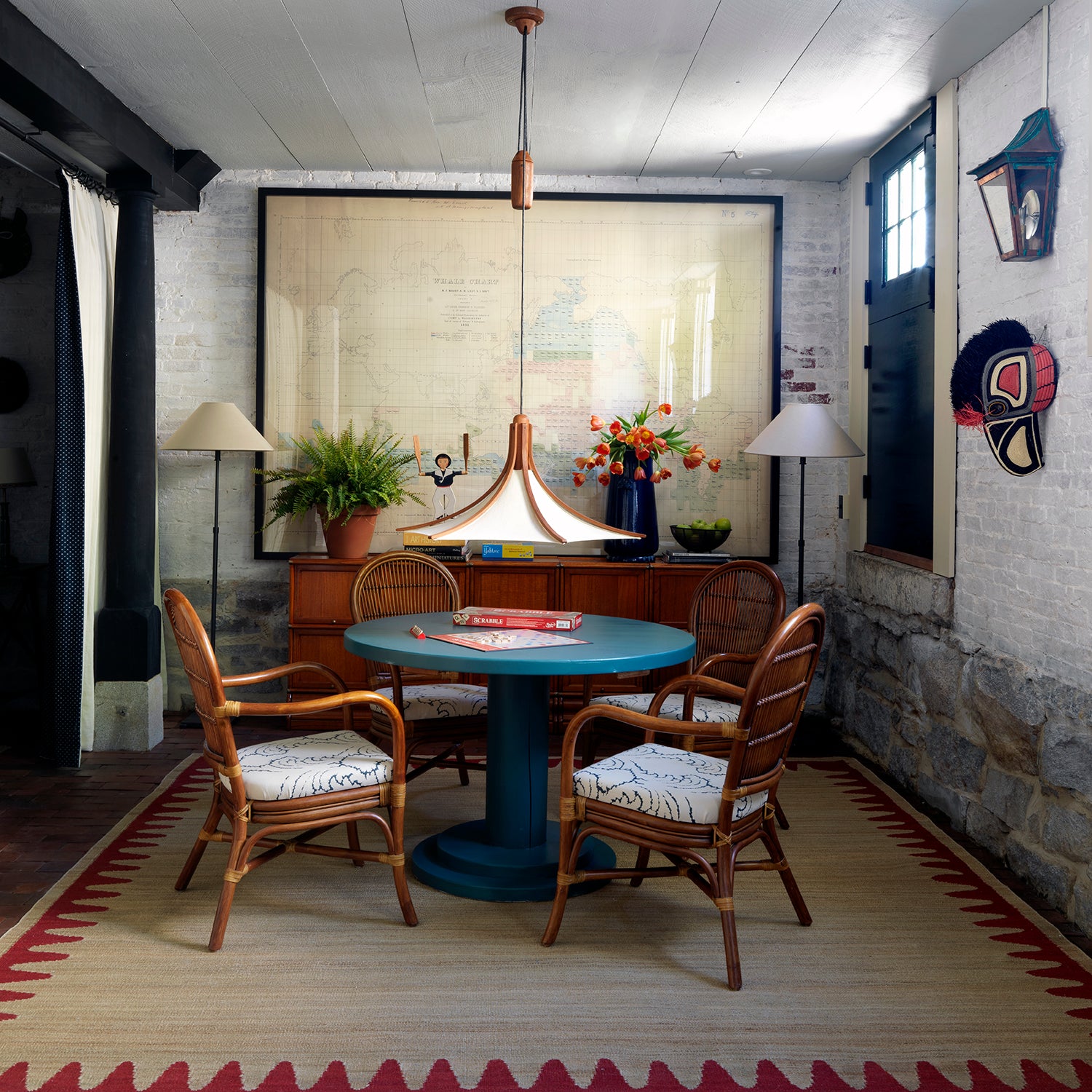
The basement was unusable before the renovations, but now houses a much needed boot room and a laundry (above). There is also a big living space and the children's 'Adventure table' (below). We added the reclaimed brick floor and it was stained a deeper, darker shade. It looks like it's been there forever.
The attic was drafty and dark when we first came to see it. We cladded all the walls and the ceiling in shiplap, which was finished in a warm off-white milkpaint. The old floor was restored but in the bathroom we painted for a 'faux-tile' effect.
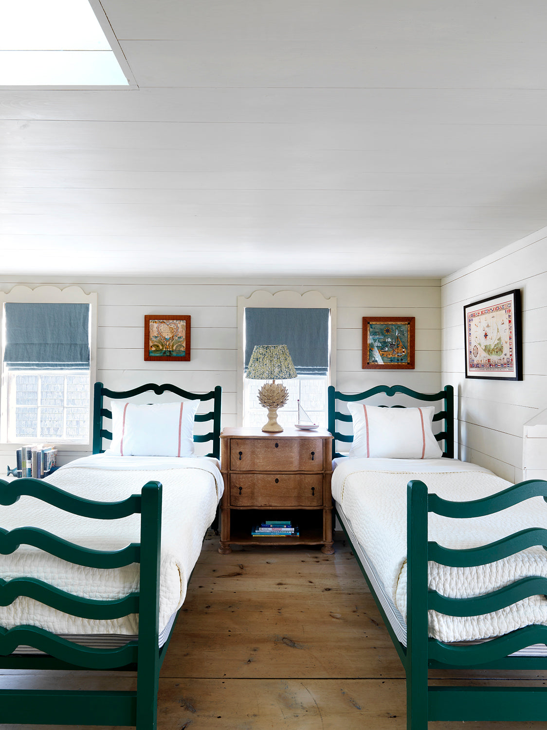
The attic was drafty and dark when we first came to see it. We cladded all the walls and the ceiling in shiplap, which was finished in a warm off-white milkpaint. The old floor was restored but in the bathroom we painted for a 'faux-tile' effect.
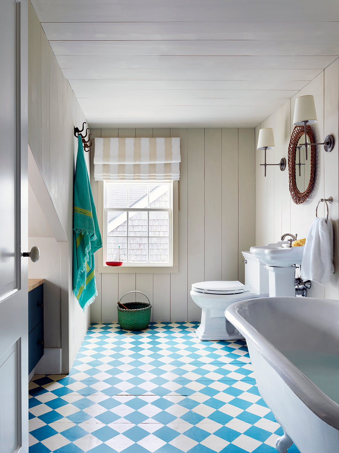
The attic was drafty and dark when we first came to see it. We cladded all the walls and the ceiling in shiplap, which was finished in a warm off-white milkpaint. The old floor was restored but in the bathroom we painted for a 'faux-tile' effect.
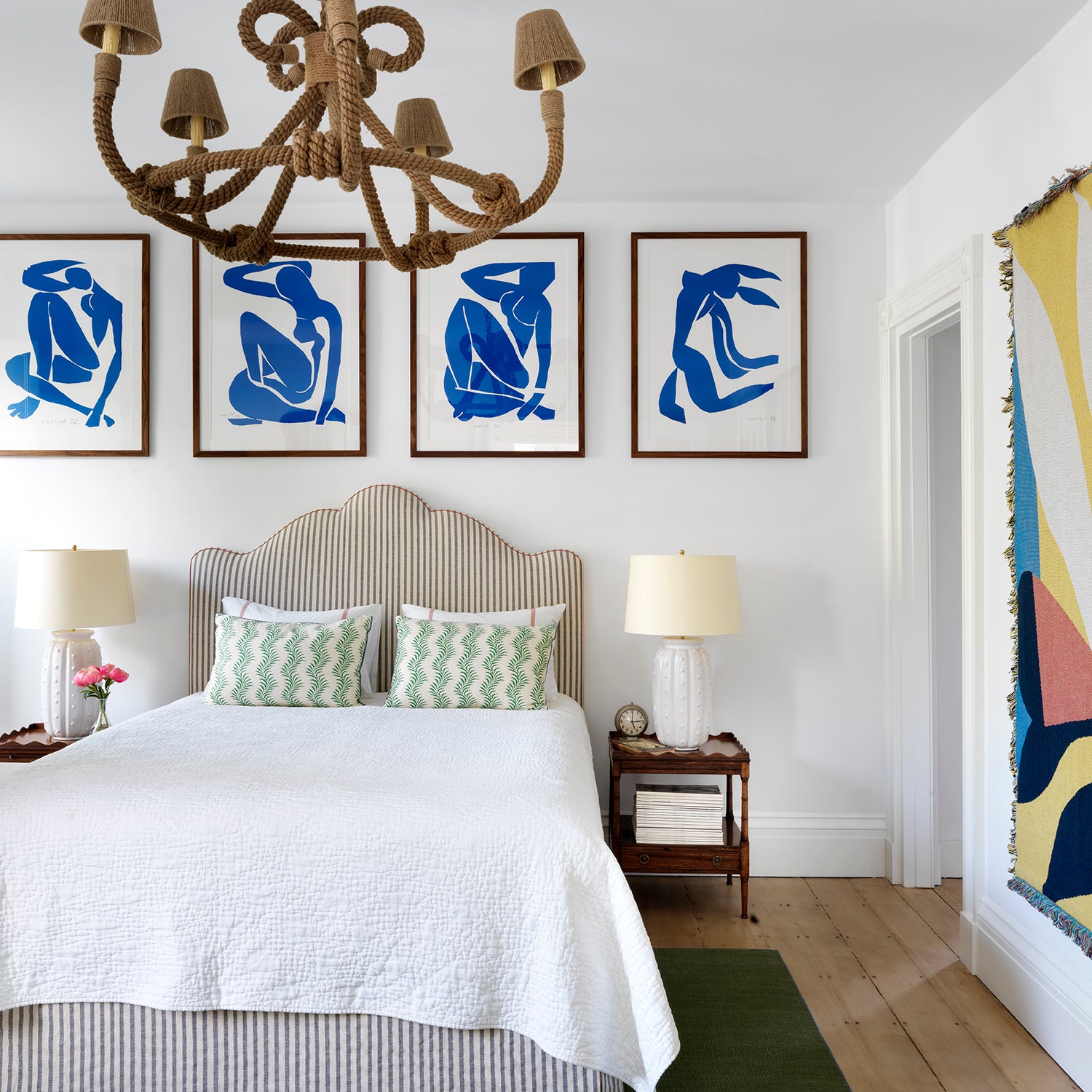
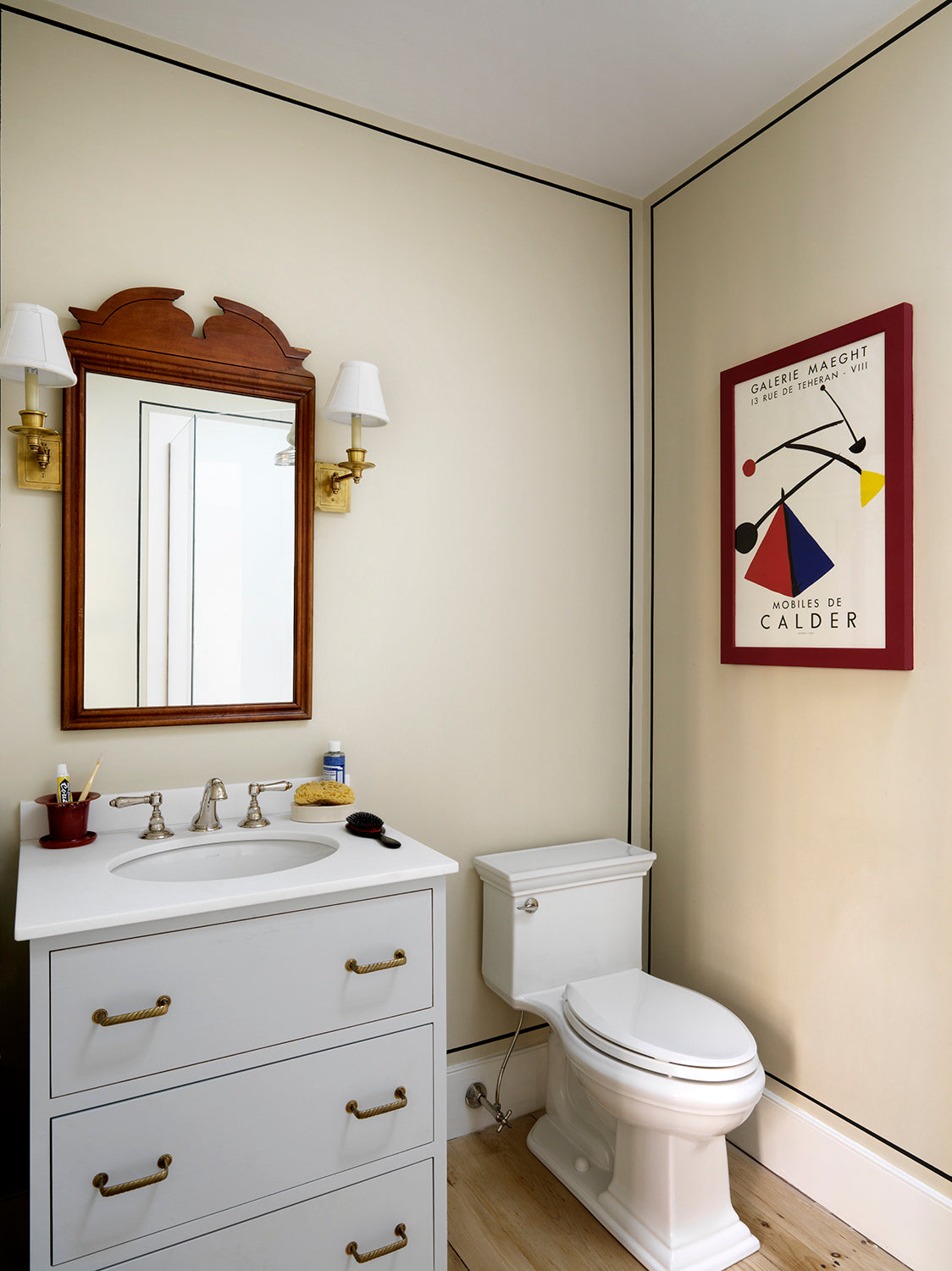
A few of the bedrooms above and below.
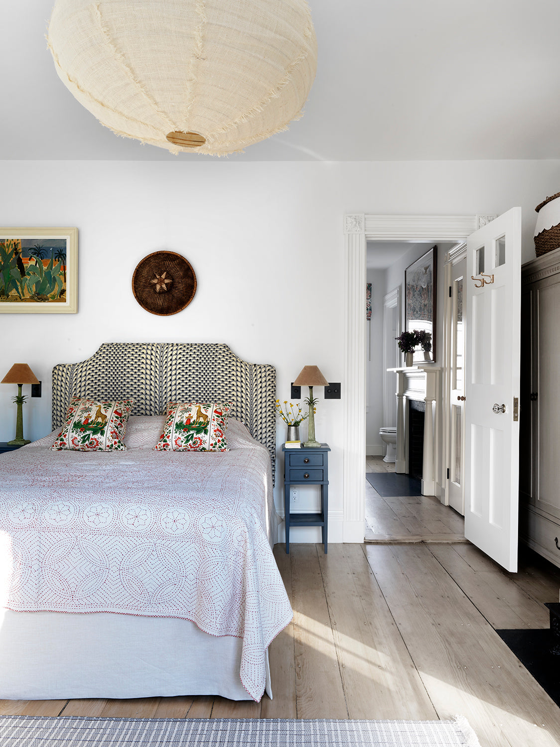
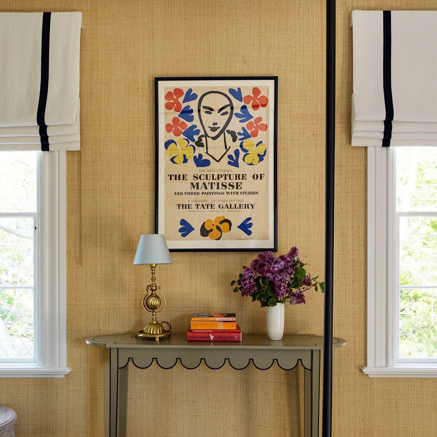
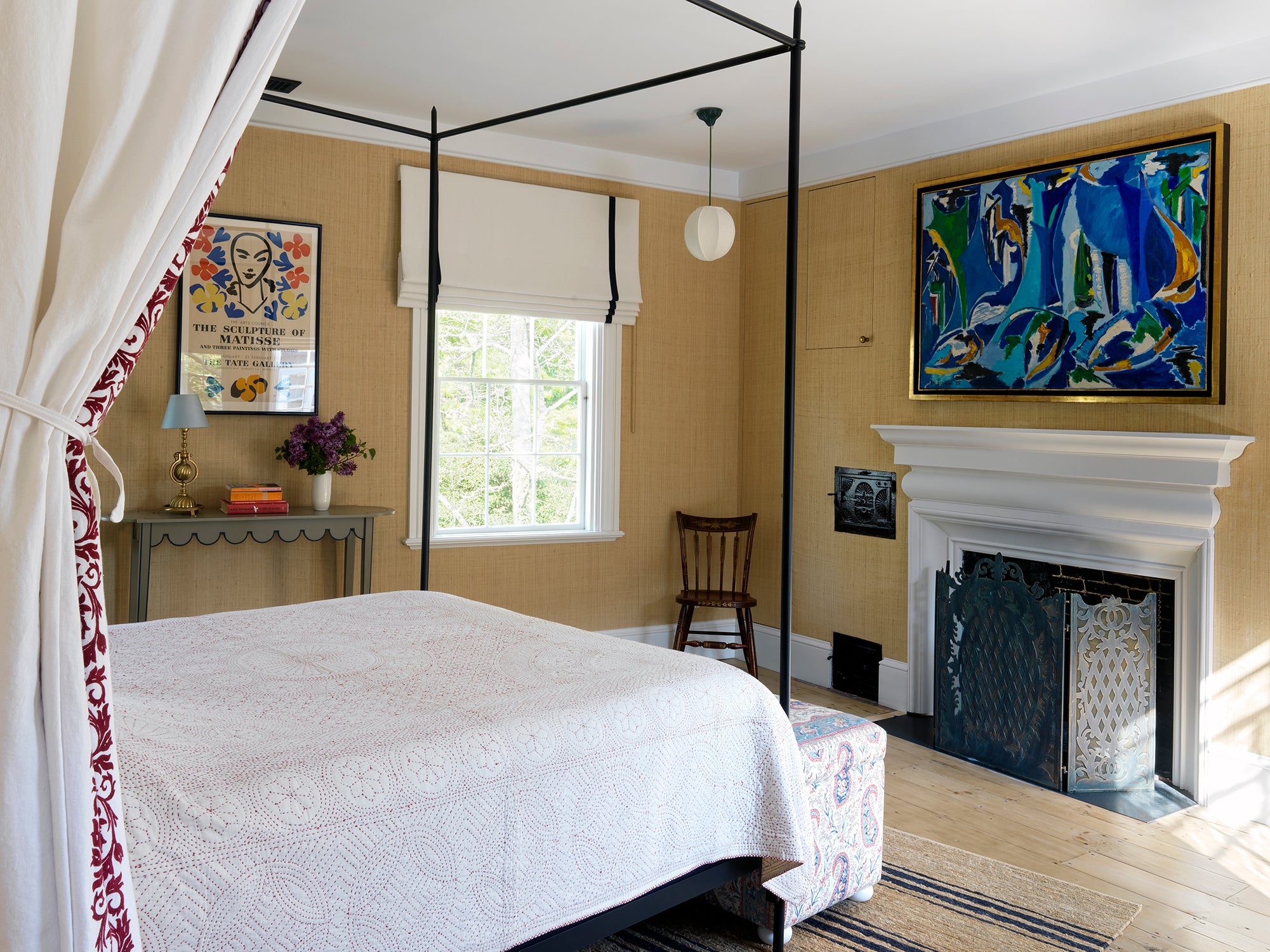
The only room with wallpaper. The original fireplace was long gone, and we took the liberty to do something 'new'. The door to the old oven, however, remains (below).
Photography: Simon Brown. Complected 2019. Nantucket.


